Category Archives: Visualization

Helpful Visualizations for Linear Regression in Python and R

Graphing and visualizing data is the one of the primary tools Data Scientists employ to perform ongoing diagnostics. While mathematical performance measures (e.g. RMSE, R-Squared, …) might be the best final measures of model viability, getting there is an iterative process of exploring data through trial-and-error means that heavily relied on visualization techniques.

Hence, introducing some of the visualizations associated with Machine Learning provides a good introduction to the modeling process. Modelers seldom follow a linear end-to-end process: typically one tries an approach or configuration followed by some process of diagnostics and re-tuning

Simple Linear Regression.

Simple Linear Regression is the most basic form of Machine Learning: ‘simple’ in the sense that only a single feature is used to approximate the dependent variable. The process is akin to drawing a line of the form below where θ0 is the intercept , θ1 the slope, and ε is an error term.

y = θ0 + θ1x + ε

The relationships can more concisely be expressed with vector and/or matrix designations.

Y = θ X

Measuring Fit of a Model

The most common loss functions and performance metrics associated with Linear Regression are the Mean Squared Error (MSE) and it’s root (RMSE). The MSE is typically expressed as something similar to the below:

$$ MSE = J(\theta) = \frac{1}{N}\sum_{n=1}^N \big(y_n – h_\theta(x_n)\big)^2$$

Solving this for θ by partial differentiation and converting the partial derivatives to a matrix form results in the so-called Normal Equation for Linear Regression

$$\theta = (X^T X)^{-1}X^Ty$$

If you are a math geek and want to get your Linear Algebra fix by comprehending the entire derivation, then there are innumerable sites that go through the derivation in painful detail including geeksforgeeks.com. In short, setting the derivative of the MSE to zero finds its minimal value–in this case the loss function is quadratic and so the minimum value is the global minimum slope. The minimum slope is the basis for finding the best fit for θ.

The problem with the Normal Equation is that finding the inverse of a matrix is not always straightforward or efficient–admittedly it works fine up to a very large set of features. If we have a case where there is a huge number of features, then we will likely have to turn to a numerical approach using Gradient Descent: this iterative approach, along with the associated demonstrations of feature engineering,, makes for a lovely and illustrative use of graphing techniques. Hence we can learn something about both numerical solutions for Linear Regression and visualization in this exercise.

Demonstration Data

To demonstrate, let’s first grab some data from Kaggle: a popular choice is the WHO Life Expectancy Dataset. Keep in mind there is no guarantee that this will data, or our choices of features and targets within the data, will be a suitable candidate for Linear Regression. That is where studying the data by observing its characteristics via visualization can inform us.

Importing this into a Jupyter Notebook and exploring it is demonstrated below.

import pandas as pd
import numpy as np
import matplotlib.pyplot as plt

#kaggle data from WHO - Life Expectancy (WHO) Fixed
#download from: https://www.kaggle.com/datasets/lashagoch/life-expectancy-who-updated
le_df = pd.read_csv("Life-Expectancy-Data-Updated.csv")
#found an extra space
le_df = le_df.rename(columns={"Life expectancy ":"Life expectancy"})
#only need two columns and want to sample from developed nations
le_df = le_df.loc[(le_df.Year==2015) &( le_df.Region.str.contains("European Union"))][["Life_expectancy","GDP_per_capita","Year","Country","Region"]]
le_df.set_index("Region", inplace=True)
Life_expectancy GDP_per_capita Year Country
Region
European Union 82.8 25742 2015 Spain
European Union 74.5 13786 2015 Latvia
European Union 82.2 51545 2015 Sweden
European Union 78.6 17830 2015 Czechia
European Union 74.3 14264 2015 Lithuania
European Union 81.5 45193 2015 Netherlands
European Union 74.6 7075 2015 Bulgaria
European Union 81.1 19250 2015 Portugal
European Union 81.5 42802 2015 Finland
European Union 80.8 20890 2015 Slovenia
European Union 81.0 41008 2015 Belgium
European Union 76.6 16342 2015 Slovak Republic
European Union 81.2 44196 2015 Austria
European Union 81.9 24922 2015 Malta
European Union 81.0 18084 2015 Greece
European Union 81.5 62012 2015 Ireland
European Union 77.3 11933 2015 Croatia
European Union 80.6 41103 2015 Germany
European Union 80.7 53255 2015 Denmark
European Union 77.5 12578 2015 Poland
European Union 82.5 30242 2015 Italy
European Union 75.6 12721 2015 Hungary
European Union 82.3 105462 2015 Luxembourg
European Union 80.4 23408 2015 Cyprus
European Union 77.6 17402 2015 Estonia
European Union 74.9 8969 2015 Romania
European Union 82.3 36653 2015 France

Exploring the Data

There are several excellent libraries that automate initial data exploration to some degree. For example, the DataPrep library will create a report exhibiting features statistics including correlations, interactions, missing or NA values, etc.

from dataprep.eda import create_report
df = pd.read_csv("Life-Expectancy-Updated.csv")
create_report(df)

Experiments

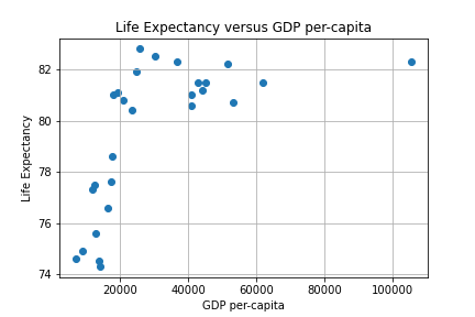
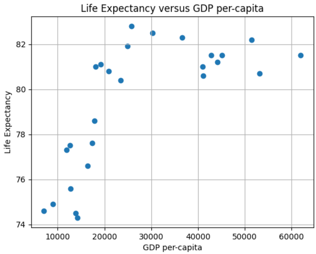
Our first experiment will be to model with Simple Linear Regression using MSE as a loss function to predict Life Expectancy given the per-capita GDP in Developed Countries. A scatter plot of the data is depicted below.

Scatter Plot of LE data

We can use two approaches to find an approximating line: the closed form via the Normal equation or a numerical iteration using Gradient Descent (GD). The Sklearn linear_model library provides a convenient routine to employ the closed form. An iterative approach consists of writing a GD algorithm from scratch.

The Mathematics of Gradient Descent

To develop a GD algorithm we will use the partial derivatives of J(θ) for estimating a predictive line. The minimum value of interest is estimated using what the derivative tells us about slope. The feature weights of the simple (i.e. two-variable) case is denoted by vector θ below :

$$y = \theta_0 + \theta_1 x $$

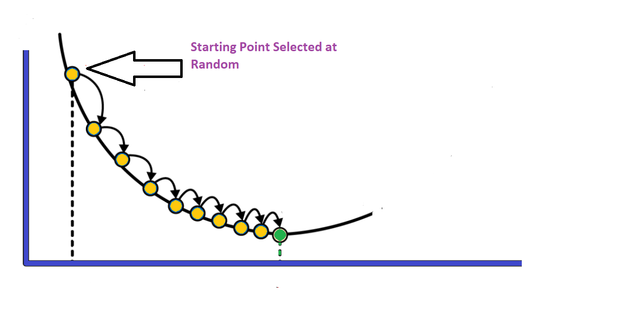
The concept of gradient descent is to converge to the best value of θ iteratively as depicted in the figure below.

The partial derivatives of the MSE cost function are given by:

$$ \frac{\partial MSE}{\partial \theta_0} = \frac{-2}{N} \sum_{i=1}^N{(y_i-{(\theta_1x+\theta_0)}) \cdot (x_i)} $$ $$ \frac{\partial MSE}{\partial \theta_1} = \frac{-2}{N} \sum_{i=1}^N{(y_i-{(\theta_1x+\theta_0)}) } $$

The simple case can be easily generalized to the multi-variable case –essentially taking a matrix of partial derivatives– and is depicted below (derivation details here). This distinction between the simple and generalized case is the cause for student confusion as to why some implementations use two gradient equations and others use the one gradient equation with the matrix form (i.e. it’s a matter of generalizing several partial derivative results into a matrix form of n different partial derivatives).

$$\nabla J(\boldsymbol{\theta})= \frac{2}{N}\mathbf{X}^T\big(\mathbf{X}\boldsymbol{\theta} – \mathbf{y}\big)$$

We can now integrate this function into Python and develop a program to gradually zero-in on the optimum solution.

Data Cleaning and Feature Engineering

First, re-visiting the scatter plot from above, it’s visually obvious that there is at least one outlier (this turns out to be the country of Luxembourg). In this case it’s not a measurement error, and what to do it with requires some reflection and possible experimentation. One approach is to employ some reasonable outlier detection and elimination.

A common data preparation approach is to begin by writing a routine that takes out outliers of more than three times the standard deviation and re-doing the scatter plot.

X_mean, X_std = X.mean(), X.std()
print(f'mean: {X_mean} \nstandard-deviation: {round(X_std,2)}')
#use 3* std as the outlier cutoff
X_cutoff_min, X_cutoff_max = X_mean-3*X_std, X_mean+3*X_std
print(f'X min: {round(X_cutoff_min,2)} \nX max: {round(X_cutoff_max,2)}')
#create a new dataframe with outlier removed
le3_df = le_df.loc[(le_df.GDP_per_capita >= X_cutoff_min) & (le_df.GDP_per_capita <= X_cutoff_max)]
le3_df.describe()

mean: 30321.0 
standard-deviation: 21024.37
X min: -32752.12 
X max: 93394.12
Life_expectancy	GDP_per_capita	Year
count	26.000000	26.000000	26.0
mean	79.403846	27430.961538	2015.0
std	2.840631	15583.743469	0.0
min	74.300000	7075.000000	2015.0
25%	77.350000	14783.500000	2015.0
50%	80.750000	22149.000000	2015.0
75%	81.500000	41079.250000	2015.0
max	82.800000	62012.000000	2015.0

Notice from above the total points has gone from 27 to 26, with the outlier of concern having been mitigated by the strategy. Removing the outlier provides, arguably, only a slightly better looking visual case for a linear approximation.

Now we have removed Luxembourg due to its very high per-capita GDP, and we are still left with a graph that appears to not be linear. Was this the right thing to do? Luxembourg’s high per-capita GDP is not noise, nor an erroneous measure: it’s an accurate measure of a country in the EU. Moreover, it wasn’t an outlier in terms of life expectancy–it was very much aligned with Western Europe.

An interesting interpretation of the above might be that we should have let Luxembourg remain, and considered Eastern Europe as essentially a different distribution. Eastern Europe nations in the EU are prone to certain habits (e.g. smoking) that align them together and result in a lower life-expectancy versus the rest of the EU. The interested reader can study the issues in more detail if desired by starting with the Sep 24th 2018 edition of the Economist.

This is one of those messy nuances of data cleaning and feature engineering that Data Scientists spend much of their time delving into to arrive at viable results. Another approach with the Luxembourg issue would be to weigh datapoints–an example would be to use the population size of the country to associate a relative weight.

Another question is: is there a better approach to visualization than a matplotlib scatter diagram that allows for quick analysis of details? For that we introduce the use of the Plotly library and also Chart Studio for easily hosting interactive Plotly graphs. With this it becomes easy to pick out the problem with Eastern Europe.

What happens to the shape of the scatter plot if we take Eastern Europe out and leave Luxembourg in? The resulting graph is below.

The First Prediction

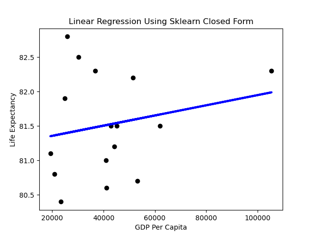
We can generate a simple prediction line using the Sklearn library as below. The code to produce this is:

from sklearn.linear_model import LinearRegression
regr = LinearRegression()
regr = LinearRegression().fit(X.reshape(-1,1),y)
y_pred = regr.predict(X.reshape(-1,1))
# Plot outputs
plt.scatter(X, y, color="black")
plt.plot(X, y_pred, color="blue", linewidth=3)
plt.title("Linear Regression Using Sklearn Closed Form")
plt.ylabel("Life Expectancy")
plt.xlabel("GDP Per Capit

Performance

A first impression might be that the slope of the line is rather flat. What does it mean when the dependent variable doesn’t change much as the independent variable varies? Horizontal lines mean the independent variable is not all that predictive.

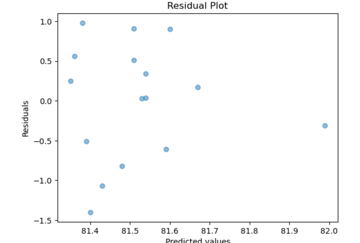
Linear Regression assumes normality of the error term. One way to test that the assumptions of Linear Regression are met is to subject the results to series of statistical tests and graphs. One of these is the graph of residuals–residuals are the errors between the predicted values and real values. Such a graph should show no discernable pattern and should center around zero. We see below that this is the case.

Next we plot a simple histogram of the residuals and check its shape against a normal bell curve.

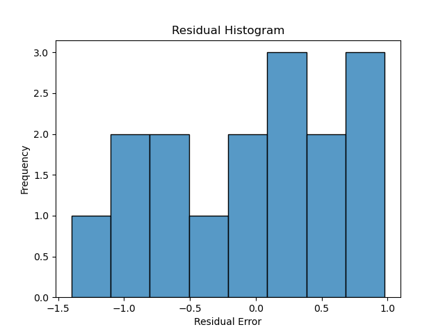
hist_plot = sns.histplot(y_pred-y,bins=8)
plt.title("Residual Histogram")
plt.ylabel("Frequency")
plt.xlabel("Residual Error")

This is a fairly limited set of points, but the plot doesn’t depict a normal curve shape as closely as would be hoped if we wanted to have confidence in the predictive value of GDP. On the other hand, there are very few datapoints in this example–exchanging two datapoints can make it look more Gaussian.

Scaling

Returning to the issue of feature engineering: a common approach to improve the look of the feature scatter plot is transformation. Applying a log transformation to X results in a more promising visualization:

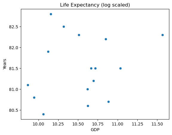
sns.scatterplot(x=np.log(X), y=y)
plt.title("Life Expectancy (log scaled)")
plt.ylabel("Years")
plt.xlabel("GDP")

The transformed inputs make for a better looking spread. It might be tempting to scale the response variable as well, but this makes for tricky interpretation.

Multiple Linear Regression

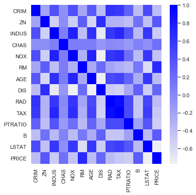
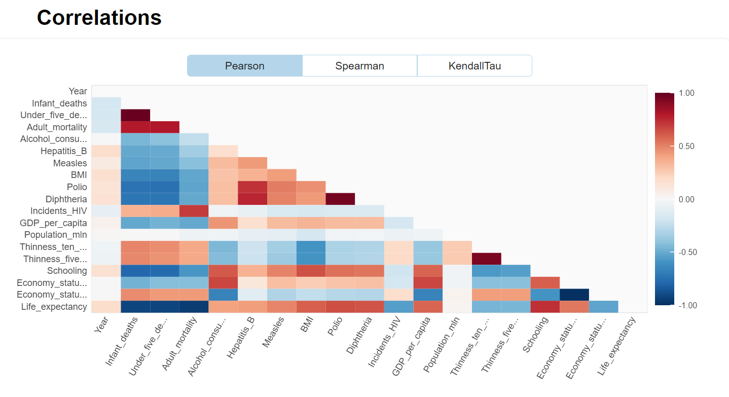
Using more than one variable would be a natural choice for our dataset. Settling on the year 2015, and choosing the most intuitive explanatory features results provides a starting point. Analyzing correlations amongst these variables with the Performance Analytics library in R results in the below chart.

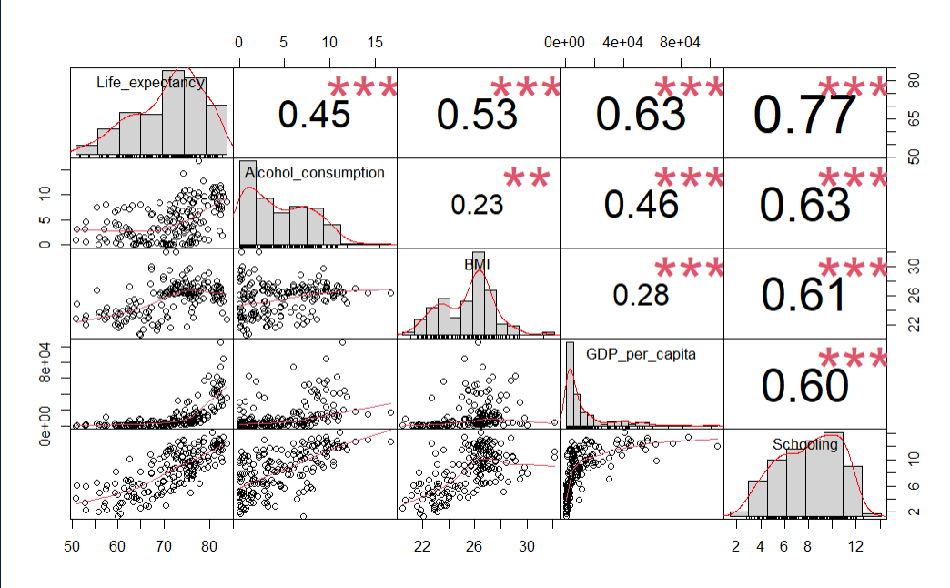
le_df <- le_df[le_df$Year == 2015,]
le_df <- le_df[-c(le_df$Year)]

# Choose some intuitive predictors
predictors <- c("Alcohol_consumption", "BMI", "GDP_per_capita", "Schooling")
data_sub <- subset(le_df,  select=c("Life_expectancy",predictors))

# Reset index
row.names(data_sub) <- NULL

# Correlation 
cor(data_sub$Life_expectancy, data_sub), check_names = False)
chart.Correlation(data_sub, histogram=TRUE, pch=19)

Using R and rstan_glm

If there is a needto shift paradigms from Maximum Likelihood to Bayesian and fit using Monte Carlo simulations versus the closed form, then a shift to Stan might be warranted. The reason for shifting to R is, in addition to just demonstrating some R Visualizations, that most people I see using Stan implementation seem to use rstan more than pystan (an anecdotal conclusion to be sure).

Initial Fit with unscaled data

fit0 <- stan_glm(Life_expectancy ~ ., data=data_sub, refresh=0)
print(fit0)

This is rstantools version 2.3.1.1
This is bayesplot version 1.10.0
- Online documentation and vignettes at mc-stan.org/bayesplot
- bayesplot theme set to bayesplot::theme_default()
   * Does _not_ affect other ggplot2 plots
   * See ?bayesplot_theme_set for details on theme setting

stan_glm
 family:       gaussian [identity]
 formula:      Life_expectancy ~ .
 observations: 179
 predictors:   5
------
                    Median MAD_SD
(Intercept)         47.7    4.8  
Alcohol_consumption -0.1    0.1  
BMI                  0.4    0.2  
GDP_per_capita       0.0    0.0  
Schooling            1.4    0.2  

Auxiliary parameter(s):
      Median MAD_SD
sigma 4.7    0.3   

Unscaled Density Graph

Density plots allow for looking at the distribution of the variables and show how they relate along with their relative normality. This can be a good tool for establishing the need and/or effect of scaling.

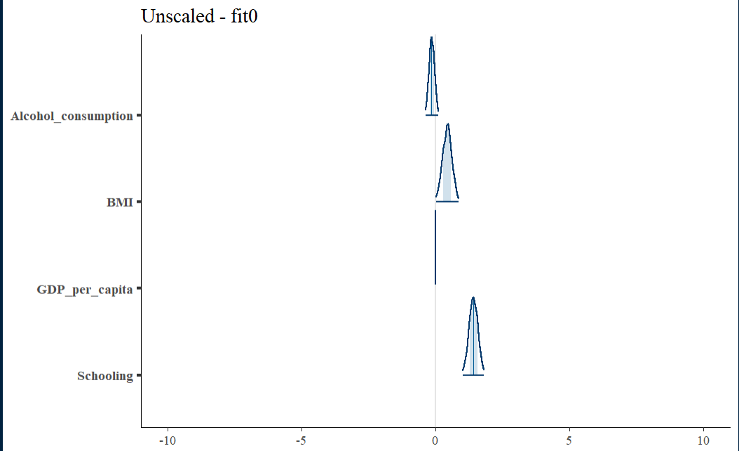
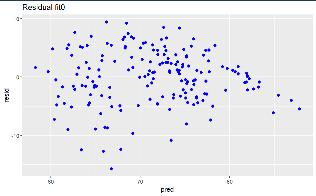
Initial fit residual

The fit0 residual graph is not terrible, but it has a hint of triangularity.

Data Visualization Using MatPlotLib Animation (1st of a Series)

There are a multitude of articles and examples out there demonstrating how to create animations using matplotlib’s FuncAnimation library. That said, they tend to be both challenging to follow and more oriented towards plotting lines than tabular data. This series of articles will delve into the details of animating tabular data plots: the plan here is start at the very beginning and explain the process in detailed steps.

The examples here will be built with a Jupyter Notebook from Anaconda 3.7.4. Data Notebooks built on Jupyter are great for documenting data explorations including sharing plotting and animation visualizations.

As a preliminary, you will need matplotlib, numpy pandas and a video writer–the writer I used is ffmpeg and I installed this via the Anaconda shell using:

conda install -c conda-forge ffmpeg

Also, the version of matplotlib used here is 3.1.2. Below is the line of code to assist in checking this on your system.

print(plt.__version__)

The first challenge of understanding the use of matplotlib is comprehending why some examples use pyplot and other axes (usually denoted as ax) objects. Suppose the aim is to draw a parabola. The first approach can be done with a few simple lines of code:

import numpy as np
import matplotlib.pyplot as plt
%matplotlib inline
#create the function: f(x) = y**2
x = np.arange(-20., 20.1, 0.5)
#draw the figure MATLAB-style with red squares
p = plt.plot(x, x**2, 'rs')
plt.xlabel("X")
plt.ylabel("Y")
plt.title("Example 1")
plt.show()
Parabola in red squares using pyplot

I think of such examples as being in the older MATLAB-style of procedural plotting. MATLAB was the inspiration for the original creator of the matplotlib library and is programmatically similar to the above code’s use of a single function to carry out all plotting tasks. In terms of implementation, this style hides the OO details. However, under the hood, the procedural style implicitly references objects and methods

The Object-Oriented approach features direct calls to the methods of the underlying objects. The underlying objects being the Figure and the Axes. Roughly, an axes object refers to the the x-axis and y-axis, but also includes the other components of the graph. Thus, axes does not strictly-speaking refer to the plural of axis in this context. Drawing the same parabola with the OO code is demonstrated below.

v = np.arange(-20., 20.1, 0.5)
fig, ax = plt.subplots()
ax.set_xlabel('V')
ax.set_ylabel('W')
ax.set_title('Example 2')
ax.plot(v,v**2,'rs')
Parabola example from OO methods

Adding Complexity

An advantage of using OO method calls is the plethora of nicely-organized customizations one can make to a graph. If a laundry-list of requirements has to be implemented:

  • custom ticks
  • colored grid
  • text or annotations
  • customized axis label with non-default font

The implementation is a simple matter of looking up the methods in the axes documentation. Below is an implementation.

x = np.arange(-20., 20.1, 0.5)
fig, ax = plt.subplots()
ax.set_xlabel('$\mathregular{x}$', fontsize=15, color='b')
ax.set_ylabel('$\mathregular{x^3}$',fontsize=15, color='b')
ax.set_title('Example 3')
#add a grid pattern
ax.grid(color='green', linestyle='--', linewidth=1)
#set the axis limits
ax.set_xlim([-10, 10])
ax.set_ylim([-1000, 1000])
#customize the x-ticks
ax.set_xticks([-10,-5, 0,5, 10])
#customize the y-ticks
ax.set_yticks([-1000,0,1000])
#add some text
ax.text(-5, 100, r"f(x) = $x^3$", color="r", fontsize=20)
ax.plot(x,x**3, lw=2)
Hyperbola example

Animating

When a static plot is not enough, Matplotlib provides simple animation tools via the animation module. In the code example below the FuncAnimation class is added to the previous hyperbola-generating code. There are some changes to the flow that are needed to implement the animation–these will be described in detail later. For now, it’s enough to appreciate the relative ease with which the examples above can be animated.

import numpy as np
import matplotlib.pyplot as plt
from matplotlib import animation 
%matplotlib inline

#create a figure and axes
#fig = plt.figure(1,1)
#ax = plt.axes(xlim=(-10, 10), ylim=(-1000, 1000))
fig,ax = plt.subplots(1,1)
plt.close() #avoid a ghost plot
line, = ax.plot([], [], lw=3) #this returns a tuple

ax.set_xlabel('$\mathregular{x}$', fontsize=15, color='b')
ax.set_ylabel('$\mathregular{x^3}$',fontsize=15, color='b', labelpad=-10)
ax.set_title('Example 4')
#add a grid pattern
ax.grid(color='green', linestyle='--', linewidth=1)

#customize the x-ticks
ax.set_xticks([-10,-5, 0,5, 10])
#customize the y-ticks
ax.set_yticks([-1000,0,1000])
#add some text
ax.text(-5, 100, r"f(x) = $x^3$", color="r", fontsize=20)

#create the data - initially empty
xdata_l = []
ydata_l = []

def animate(n):
    '''
    produces a sequence of values when called sequentially
    '''
    xdata_l.append(n)
    ydata_l.append(n**3)
    line.set_xdata(xdata_l)
    line.set_ydata(ydata_l)
    return line,

def init():
    line.set_data([], [])
    return line,

#generator
def gen_function():
    '''
    Generate the values used for frame number
    '''
    for i in np.arange(-20,20.1,.5):
        yield i


#animate
anim = animation.FuncAnimation(fig, animate, init_func=init, frames=gen_function, interval=50)

#play this animation on Jupyterlab
from IPython.display import HTML
HTML(anim.to_html5_video())

This produces the following video:

Animation of the hyperbola

The resulting animation, in video form, can be downloaded from Jupyterlab simply by clicking on the three dots and choosing download.

Saving the video

Seaborn For Visualization Of Matrices

The Seaborn Data Visualization Library is a great tool for the Infosec Analyst toolbox–it’s simple to use, versatile to deploy, and is built to integrate with Pandas and extend Matplotlib.

Simple Example

We can start with a very simple example of a matrix shape generated by using a DataFrame comprised of random Integers to show off a heatmap:

import seaborn as sns
import numpy as np
import pandas as pd
import matplotlib.pyplot as plt
%matplotlib inline 
df = pd.DataFrame(np.random.randint(0,100,size=(4, 4)), 
                  columns=list('ABCD'))
plt.figure(figsize = (6,6))
sns.heatmap(df, annot=True, square=True) 

Note that this largely default heatmap uses a continuous gradient for a color map. This makes sense–it is after all a ‘heatmap’, and the gradient is the logical choice for expressing the relative “temperature” of the values. That said, we will take a look at controlling and customizing the color palette, along with how to create a discrete color palette when needed.

Tip

If you are using Matplotlib 3.1.1, you will likely never render a nice heatmap due to a bug. Use Matplotlib 3.1.2 instead:

import matplotlib as mpl
mpl.__version__

The version used here outputs: ‘3.1.2’. Also, the version of Seaborn that is used here is .0.11.1.

More Useful Examples

One of the more useful applications of heatmaps is for expressing correlation matrices of various features. Building on the above, we can construct a correlation matrix with a custom color scheme against a popular demonstration dataset. Sklearn, as well as Seaborn, have sample datasets baked into the library that are easily loaded and experimented with. Below is an example of the Boston Housing dataset used to generate a simple correlation matrix using a gradient of blues:

from sklearn.datasets import load_boston
data = load_boston()
df = pd.DataFrame(data.data, columns=data.feature_names)
df['PRICE'] = data.target
cmap = sns.light_palette("#0000ff", as_cmap=True)
sns.heatmap(df.corr(), cmap=cmap)

“RM” refers to rooms per dwelling in the above matrix. It makes intuitive sense that rooms per dwelling would increase with price–hence establishing a positive correlation. This intuition is proven true by the strong ‘blueness’ in the heatmap.

Seaborn can do more than just heatmaps, it creates artful plots that convey added information through color and point size. Exploring the correlation of rooms to price with a scatter plot demonstrates this. Seaborn allows for a simple scatterplot that demonstrates the correlation while signifying both price and which houses bound the St Charles River (“CHAS”).

sns.set_theme(style="white")
#plot Rooms to Price - positive correlation
sns.relplot(x="RM", y="PRICE",hue="CHAS",size="PRICE",
            sizes=(20, 200), alpha=.5, palette="muted",
            height=6, data=df)

Discrete Mappings

It may be useful to assign colors discretely, i.e. a color corresponds to a value or value interval. For example in a confusion matrix if a certain rate (e.g. TPR) is acceptable it might get the color green. Here is how this may be achieved:

#create a discrete color mapping
colors = ['red', 'yellow','lightgreen','green']
levels = [0,1,2,3,4]
cmap, norm = mpl.colors.from_levels_and_colors(levels=levels, colors=colors)
df = pd.DataFrame(np.random.randint(0,4,size=(4, 4)), 
                  columns=list('ABCD'))
sns.heatmap(df, annot=True, square=True, cmap=cmap)

Relationship Visualization

Network Science is, roughly speaking, the application of traditional Graph Theory to ‘real’ or empirical data versus mathematical abstractions. Modern Network Science courses, versus older Graph Theory courses, describe techniques for the analysis of large, complex ‘real world’ networks such as social networks. The topics tend to be mathematically challenging including community detection, centrality, Scale-Free modeling versus Random modeling and the associated probability distributions underlying the degree structure. In short, If you have a lot of interconnected data or logs, Network Science can likely help you organize and understand it.

Simple Visualization

For starters, complex network graphs often lend themselves to abstract relationship visualization of qualities not otherwise apparent. We can think of two categories of visualization: explicit attributes versus more subtle attributes inferred from algorithmic analysis such as community detection on what is perceived as a ‘lower‘ or secondary quality.  This second category could be based on machine learning, but no use in getting lost in marketing.

Most security professionals use explicit visualizations throughout the day, and likely would be lost without them–for example a chart of some event occurrence against time: if you use the Splunk timeline to pinpoint spikes in failed logins, you are using a data visualization to spot and explore potential attacks. Splunk is doing a large amount of work behind the scenes to present you with this, but it is still a simple representation against a time series, and it was always a relationship that  was readily apparent in conceptual terms–incredibly useful, but simply an implicit use of a standard deviation to note trends.

Another example is the ubiquitous use of Geo-IP data. Many organizations like to display the appearance and disappearance of connections in geographic terms: this makes for a nice world map at the SOC. Everyone can collectively gasp in the unlikely event that North Korea pops up. The reality is that the North Korean hackers are likely off hijacking satellite internet connections to launch their attacks as a source IP of Pyongyang is not all that discreet. Hence, discovering more subtle correlations may be warranted.

The deviation in this case consists of visualizing IP traffic from  ‘suspicious’ sources not normally seen. This geographic profiling is a valid tool in a threat hunter’s arsenal. The more interesting question, though: what more subtle qualities can we layer below the surface of that geographic profiling lead to glean more useful results-are there ways we could associate this with  a satellite-service IP or a pattern that leads us to look at other related domain registrations and cross-reference against our traffic? If we find some type of association, can we find even more subtle attributes in a like community: for example, is there a pattern or idiosyncrasy  of domain registration/registrars that an algorithm could uncover through community detection (use of free registrars, pattern in name of registration, contact details, time, etc)?

This is a potentially rich area of research. Going forward it will be interesting to study schemes for enriching data (e.g. essentially tying graph nodes and edges to JSON documents with meta-information). For now, just a simple demonstration of Threat Intelligence to graphing will be the exercise.

Threat Intelligence can lead to  more useful Simple  Visualizations

One way to glean useful insights involves  comparing traffic and connections logs with malware feeds, new domain lists, or other lists sites of low reputation. The results can be processed as a text list to review, but a graph depicting where an internal ‘victim’ address has touched along with internal connections to the victim is more interesting and potentially more helpful to a hunting team. The novel aspect of a graph visualization is the potential to view paths in detail.

A starter kit for reputation-based path visualizations might include:

  1. a threats or malware feed
  2. a connections log
  3. Python code parsing the above and saving results to a Networkx module graph
  4. Gephi for visualization

Suppose we have a threats feed with malware addresses (for simplicity lets use IPs), and a simple log of connections: the threats feed can be a list of IPs and the connections log a sequence of [Sender-IP, S-port, Receiver-IP, R-port, Transport, Protocol] objects. The objective  is to leverage simple visualizations to gauge exposure–a very simple example of visualizing a compromised internal address 10.3.2.2 is shown below.

en

We start by developing some code using the Python Networkx module to evaluate traffic logs and threat feeds and come up with intersections. Connections with bad actors get colored ‘red’. Conversations with outside hosts in general might be ‘blue’, and internal hosts might be ‘green’.

##################################################
# name: color_threats(g, u_lst, t_lst, e_lst)
# desc: add a color attribute to designate threat nodes
# input: nx.Graph g, list lst , list lst
# output: na
# notes: unique list, threats list and external IPs list
# are used to color
connected nodes
##################################################
def color_threats(g, u_lst , t_lst, e_lst):
    # e_lst is the list of external IPs
    # if an address is external, color it blue
    ext = re.compile(r’^192.168.*|^10.’)
        for j in e_lst:
            if not ext.match(j):
                g.node[j][‘viz’] = {‘color’: {‘r’: 0, ‘g’: 0, ‘b’: 255, ‘a’: 0}}
            else:
                g.node[j][‘viz’] = {‘color’: {‘r’: 34, ‘g’: 139, ‘b’: 34, ‘a’: 0}}

    # color the malware nodes
    risk_nodes = list(set(u_lst).intersection(t_lst))
        for i in risk_nodes:
            g.node[i][‘viz’] = {‘color’: {‘r’: 255, ‘g’: 0, ‘b’: 0, ‘a’: 0}}

The whole program is available on GitHub here. Below is a depiction of a malware connection on a busy network. Depending on how you lay them out, the visualizations can be large, hence this is an excerpt.

Layout on the fly (in one step) remains an interesting issue as Python code and Gephi visualizer are not entirely integrated.  A finished code base would ideally provide daily automated visualizations that one could click into to bring up details such as protocols, data volume, etc.

Looking to Network Science

Simple graph visualizations might end up being very useful in some contexts in place of trying to understand many lines of summarized logging. However, the strength of Network Science lies in attempting to use algorithmic analysis of very large data sets to bring to light things not quickly apparent. A typical large complex network simply looks like a blob when brought up graphically. Injecting algorithmic  interpretations of centrality and community detection based on attribute information embedded in the edges and nodes can lead to visualizations that provide breakthrough insights.