Network Science is, roughly speaking, the application of traditional Graph Theory to ‘real’ or empirical data versus mathematical abstractions. Modern Network Science courses, versus older Graph Theory courses, describe techniques for the analysis of large, complex ‘real world’ networks such as social networks. The topics tend to be mathematically challenging including community detection, centrality, Scale-Free modeling versus Random modeling and the associated probability distributions underlying the degree structure. In short, If you have a lot of interconnected data or logs, Network Science can likely help you organize and understand it.
Simple Visualization
For starters, complex network graphs often lend themselves to abstract relationship visualization of qualities not otherwise apparent. We can think of two categories of visualization: explicit attributes versus more subtle attributes inferred from algorithmic analysis such as community detection on what is perceived as a ‘lower‘ or secondary quality. This second category could be based on machine learning, but no use in getting lost in marketing.
Most security professionals use explicit visualizations throughout the day, and likely would be lost without them–for example a chart of some event occurrence against time: if you use the Splunk timeline to pinpoint spikes in failed logins, you are using a data visualization to spot and explore potential attacks. Splunk is doing a large amount of work behind the scenes to present you with this, but it is still a simple representation against a time series, and it was always a relationship that was readily apparent in conceptual terms–incredibly useful, but simply an implicit use of a standard deviation to note trends.

Another example is the ubiquitous use of Geo-IP data. Many organizations like to display the appearance and disappearance of connections in geographic terms: this makes for a nice world map at the SOC. Everyone can collectively gasp in the unlikely event that North Korea pops up. The reality is that the North Korean hackers are likely off hijacking satellite internet connections to launch their attacks as a source IP of Pyongyang is not all that discreet. Hence, discovering more subtle correlations may be warranted.
The deviation in this case consists of visualizing IP traffic from ‘suspicious’ sources not normally seen. This geographic profiling is a valid tool in a threat hunter’s arsenal. The more interesting question, though: what more subtle qualities can we layer below the surface of that geographic profiling lead to glean more useful results-are there ways we could associate this with a satellite-service IP or a pattern that leads us to look at other related domain registrations and cross-reference against our traffic? If we find some type of association, can we find even more subtle attributes in a like community: for example, is there a pattern or idiosyncrasy of domain registration/registrars that an algorithm could uncover through community detection (use of free registrars, pattern in name of registration, contact details, time, etc)?
This is a potentially rich area of research. Going forward it will be interesting to study schemes for enriching data (e.g. essentially tying graph nodes and edges to JSON documents with meta-information). For now, just a simple demonstration of Threat Intelligence to graphing will be the exercise.
Threat Intelligence can lead to more useful Simple Visualizations
One way to glean useful insights involves comparing traffic and connections logs with malware feeds, new domain lists, or other lists sites of low reputation. The results can be processed as a text list to review, but a graph depicting where an internal ‘victim’ address has touched along with internal connections to the victim is more interesting and potentially more helpful to a hunting team. The novel aspect of a graph visualization is the potential to view paths in detail.
A starter kit for reputation-based path visualizations might include:
- a threats or malware feed
- a connections log
- Python code parsing the above and saving results to a Networkx module graph
- Gephi for visualization
Suppose we have a threats feed with malware addresses (for simplicity lets use IPs), and a simple log of connections: the threats feed can be a list of IPs and the connections log a sequence of [Sender-IP, S-port, Receiver-IP, R-port, Transport, Protocol] objects. The objective is to leverage simple visualizations to gauge exposure–a very simple example of visualizing a compromised internal address 10.3.2.2 is shown below.
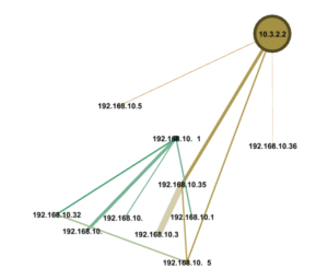
We start by developing some code using the Python Networkx module to evaluate traffic logs and threat feeds and come up with intersections. Connections with bad actors get colored ‘red’. Conversations with outside hosts in general might be ‘blue’, and internal hosts might be ‘green’.
##################################################
# name: color_threats(g, u_lst, t_lst, e_lst)
# desc: add a color attribute to designate threat nodes
# input: nx.Graph g, list lst , list lst
# output: na
# notes: unique list, threats list and external IPs list
# are used to color connected nodes
##################################################
def color_threats(g, u_lst , t_lst, e_lst):
# e_lst is the list of external IPs
# if an address is external, color it blue
ext = re.compile(r’^192.168.*|^10.’)
for j in e_lst:
if not ext.match(j):
g.node[j][‘viz’] = {‘color’: {‘r’: 0, ‘g’: 0, ‘b’: 255, ‘a’: 0}}
else:
g.node[j][‘viz’] = {‘color’: {‘r’: 34, ‘g’: 139, ‘b’: 34, ‘a’: 0}}
# color the malware nodes
risk_nodes = list(set(u_lst).intersection(t_lst))
for i in risk_nodes:
g.node[i][‘viz’] = {‘color’: {‘r’: 255, ‘g’: 0, ‘b’: 0, ‘a’: 0}}
The whole program is available on GitHub here. Below is a depiction of a malware connection on a busy network. Depending on how you lay them out, the visualizations can be large, hence this is an excerpt.
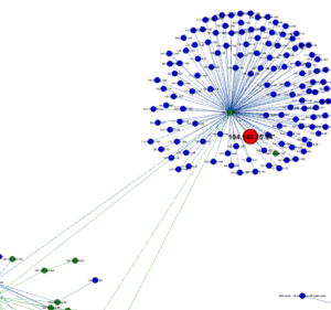
Layout on the fly (in one step) remains an interesting issue as Python code and Gephi visualizer are not entirely integrated. A finished code base would ideally provide daily automated visualizations that one could click into to bring up details such as protocols, data volume, etc.
Looking to Network Science
Simple graph visualizations might end up being very useful in some contexts in place of trying to understand many lines of summarized logging. However, the strength of Network Science lies in attempting to use algorithmic analysis of very large data sets to bring to light things not quickly apparent. A typical large complex network simply looks like a blob when brought up graphically. Injecting algorithmic interpretations of centrality and community detection based on attribute information embedded in the edges and nodes can lead to visualizations that provide breakthrough insights.