The Seaborn Data Visualization Library is a great tool for the Infosec Analyst toolbox–it’s simple to use, versatile to deploy, and is built to integrate with Pandas and extend Matplotlib.
Simple Example
We can start with a very simple example of a matrix shape generated by using a DataFrame comprised of random Integers to show off a heatmap:
import seaborn as sns
import numpy as np
import pandas as pd
import matplotlib.pyplot as plt
%matplotlib inline
df = pd.DataFrame(np.random.randint(0,100,size=(4, 4)),
                  columns=list('ABCD'))
plt.figure(figsize = (6,6))
sns.heatmap(df, annot=True, square=True)
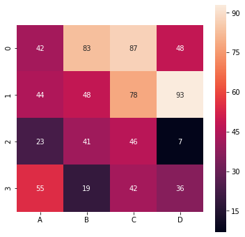
Note that this largely default heatmap uses a continuous gradient for a color map. This makes sense–it is after all a ‘heatmap’, and the gradient is the logical choice for expressing the relative “temperature” of the values. That said, we will take a look at controlling and customizing the color palette, along with how to create a discrete color palette when needed.
Tip
If you are using Matplotlib 3.1.1, you will likely never render a nice heatmap due to a bug. Use Matplotlib 3.1.2 instead:
import matplotlib as mpl
mpl.__version__
The version used here outputs: ‘3.1.2’. Also, the version of Seaborn that is used here is .0.11.1.
More Useful Examples
One of the more useful applications of heatmaps is for expressing correlation matrices of various features. Building on the above, we can construct a correlation matrix with a custom color scheme against a popular demonstration dataset. Sklearn, as well as Seaborn, have sample datasets baked into the library that are easily loaded and experimented with. Below is an example of the Boston Housing dataset used to generate a simple correlation matrix using a gradient of blues:
from sklearn.datasets import load_boston
data = load_boston()
df = pd.DataFrame(data.data, columns=data.feature_names)
df['PRICE'] = data.target
cmap = sns.light_palette("#0000ff", as_cmap=True)
sns.heatmap(df.corr(), cmap=cmap)
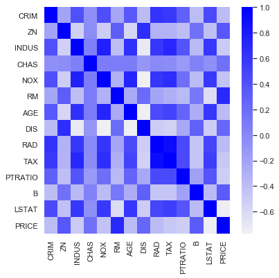
“RM” refers to rooms per dwelling in the above matrix. It makes intuitive sense that rooms per dwelling would increase with price–hence establishing a positive correlation. This intuition is proven true by the strong ‘blueness’ in the heatmap.
Seaborn can do more than just heatmaps, it creates artful plots that convey added information through color and point size. Exploring the correlation of rooms to price with a scatter plot demonstrates this. Seaborn allows for a simple scatterplot that demonstrates the correlation while signifying both price and which houses bound the St Charles River (“CHAS”).
sns.set_theme(style="white")
#plot Rooms to Price - positive correlation
sns.relplot(x="RM", y="PRICE",hue="CHAS",size="PRICE",
            sizes=(20, 200), alpha=.5, palette="muted",
            height=6, data=df)

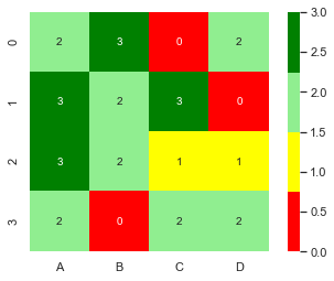
Discrete Mappings
It may be useful to assign colors discretely, i.e. a color corresponds to a value or value interval. For example in a confusion matrix if a certain rate (e.g. TPR) is acceptable it might get the color green. Here is how this may be achieved:
#create a discrete color mapping
colors = ['red', 'yellow','lightgreen','green']
levels = [0,1,2,3,4]
cmap, norm = mpl.colors.from_levels_and_colors(levels=levels, colors=colors)
df = pd.DataFrame(np.random.randint(0,4,size=(4, 4)),
                  columns=list('ABCD'))
sns.heatmap(df, annot=True, square=True, cmap=cmap)