Graphing and visualizing data is the one of the primary tools Data Scientists employ to perform ongoing diagnostics. While mathematical performance measures (e.g. RMSE, R-Squared, …) might be the best final measures of model viability, getting there is an iterative process of exploring data through trial-and-error means that heavily relied on visualization techniques.
Hence, introducing some of the visualizations associated with Machine Learning provides a good introduction to the modeling process. Modelers seldom follow a linear end-to-end process: typically one tries an approach or configuration followed by some process of diagnostics and re-tuning
Simple Linear Regression.
Simple Linear Regression is the most basic form of Machine Learning: ‘simple’ in the sense that only a single feature is used to approximate the dependent variable. The process is akin to drawing a line of the form below where θ0 is the intercept , θ1 the slope, and ε is an error term.
y = θ0 + θ1x + ε
The relationships can more concisely be expressed with vector and/or matrix designations.
Y = θ X
Measuring Fit of a Model
The most common loss functions and performance metrics associated with Linear Regression are the Mean Squared Error (MSE) and it’s root (RMSE). The MSE is typically expressed as something similar to the below:
Solving this for θ by partial differentiation and converting the partial derivatives to a matrix form results in the so-called Normal Equation for Linear Regression
If you are a math geek and want to get your Linear Algebra fix by comprehending the entire derivation, then there are innumerable sites that go through the derivation in painful detail including geeksforgeeks.com. In short, setting the derivative of the MSE to zero finds its minimal value–in this case the loss function is quadratic and so the minimum value is the global minimum slope. The minimum slope is the basis for finding the best fit for θ.
The problem with the Normal Equation is that finding the inverse of a matrix is not always straightforward or efficient–admittedly it works fine up to a very large set of features. If we have a case where there is a huge number of features, then we will likely have to turn to a numerical approach using Gradient Descent: this iterative approach, along with the associated demonstrations of feature engineering,, makes for a lovely and illustrative use of graphing techniques. Hence we can learn something about both numerical solutions for Linear Regression and visualization in this exercise.
Demonstration Data
To demonstrate, let’s first grab some data from Kaggle: a popular choice is the WHO Life Expectancy Dataset. Keep in mind there is no guarantee that this will data, or our choices of features and targets within the data, will be a suitable candidate for Linear Regression. That is where studying the data by observing its characteristics via visualization can inform us.
Importing this into a Jupyter Notebook and exploring it is demonstrated below.
import pandas as pd
import numpy as np
import matplotlib.pyplot as plt

#kaggle data from WHO - Life Expectancy (WHO) Fixed
#download from: https://www.kaggle.com/datasets/lashagoch/life-expectancy-who-updated
le_df = pd.read_csv("Life-Expectancy-Data-Updated.csv")
#found an extra space
le_df = le_df.rename(columns={"Life expectancy ":"Life expectancy"})
#only need two columns and want to sample from developed nations
le_df = le_df.loc[(le_df.Year==2015) &( le_df.Region.str.contains("European Union"))][["Life_expectancy","GDP_per_capita","Year","Country","Region"]]
le_df.set_index("Region", inplace=True)
| Life_expectancy | GDP_per_capita | Year | Country | |
|---|---|---|---|---|
| Region | ||||
| European Union | 82.8 | 25742 | 2015 | Spain |
| European Union | 74.5 | 13786 | 2015 | Latvia |
| European Union | 82.2 | 51545 | 2015 | Sweden |
| European Union | 78.6 | 17830 | 2015 | Czechia |
| European Union | 74.3 | 14264 | 2015 | Lithuania |
| European Union | 81.5 | 45193 | 2015 | Netherlands |
| European Union | 74.6 | 7075 | 2015 | Bulgaria |
| European Union | 81.1 | 19250 | 2015 | Portugal |
| European Union | 81.5 | 42802 | 2015 | Finland |
| European Union | 80.8 | 20890 | 2015 | Slovenia |
| European Union | 81.0 | 41008 | 2015 | Belgium |
| European Union | 76.6 | 16342 | 2015 | Slovak Republic |
| European Union | 81.2 | 44196 | 2015 | Austria |
| European Union | 81.9 | 24922 | 2015 | Malta |
| European Union | 81.0 | 18084 | 2015 | Greece |
| European Union | 81.5 | 62012 | 2015 | Ireland |
| European Union | 77.3 | 11933 | 2015 | Croatia |
| European Union | 80.6 | 41103 | 2015 | Germany |
| European Union | 80.7 | 53255 | 2015 | Denmark |
| European Union | 77.5 | 12578 | 2015 | Poland |
| European Union | 82.5 | 30242 | 2015 | Italy |
| European Union | 75.6 | 12721 | 2015 | Hungary |
| European Union | 82.3 | 105462 | 2015 | Luxembourg |
| European Union | 80.4 | 23408 | 2015 | Cyprus |
| European Union | 77.6 | 17402 | 2015 | Estonia |
| European Union | 74.9 | 8969 | 2015 | Romania |
| European Union | 82.3 | 36653 | 2015 | France |
Exploring the Data
There are several excellent libraries that automate initial data exploration to some degree. For example, the DataPrep library will create a report exhibiting features statistics including correlations, interactions, missing or NA values, etc.
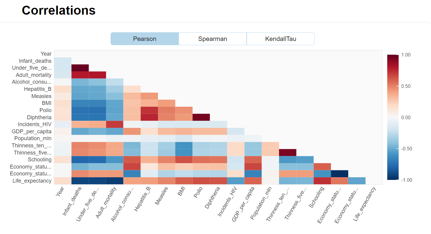
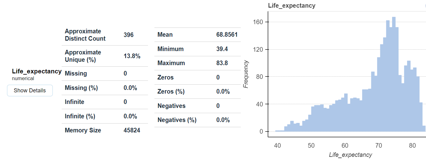
from dataprep.eda import create_report
df = pd.read_csv("Life-Expectancy-Updated.csv")
create_report(df)
Experiments
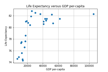
Our first experiment will be to model with Simple Linear Regression using MSE as a loss function to predict Life Expectancy given the per-capita GDP in Developed Countries. A scatter plot of the data is depicted below.
We can use two approaches to find an approximating line: the closed form via the Normal equation or a numerical iteration using Gradient Descent (GD). The Sklearn linear_model library provides a convenient routine to employ the closed form. An iterative approach consists of writing a GD algorithm from scratch.
The Mathematics of Gradient Descent
To develop a GD algorithm we will use the partial derivatives of J(θ) for estimating a predictive line. The minimum value of interest is estimated using what the derivative tells us about slope. The feature weights of the simple (i.e. two-variable) case is denoted by vector θ below :
The concept of gradient descent is to converge to the best value of θ iteratively as depicted in the figure below.
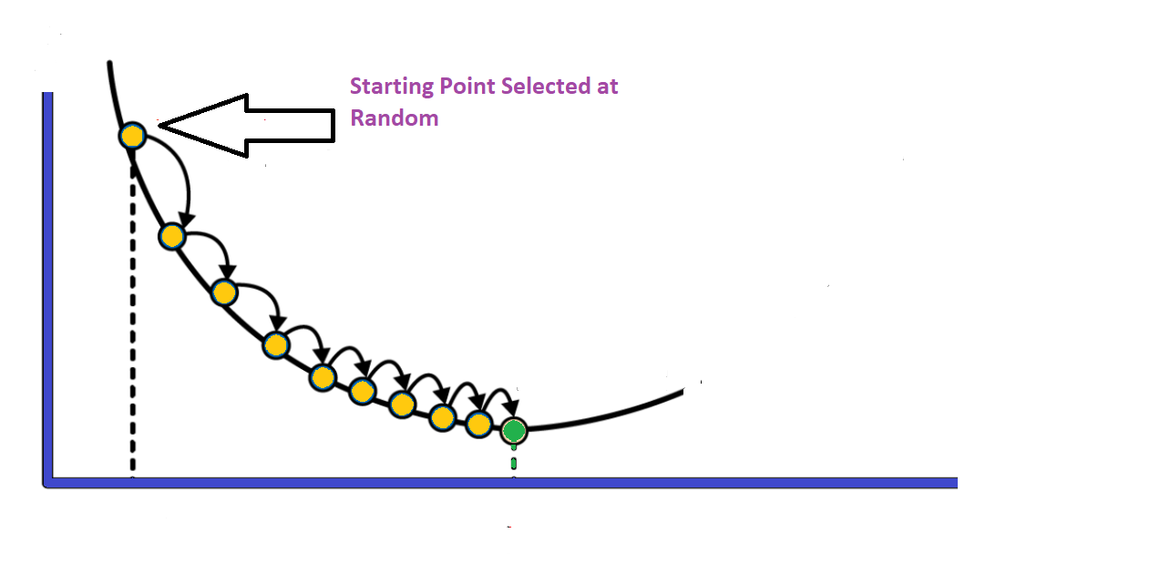
The partial derivatives of the MSE cost function are given by:
The simple case can be easily generalized to the multi-variable case –essentially taking a matrix of partial derivatives– and is depicted below (derivation details here). This distinction between the simple and generalized case is the cause for student confusion as to why some implementations use two gradient equations and others use the one gradient equation with the matrix form (i.e. it’s a matter of generalizing several partial derivative results into a matrix form of n different partial derivatives).
We can now integrate this function into Python and develop a program to gradually zero-in on the optimum solution.
Data Cleaning and Feature Engineering
First, re-visiting the scatter plot from above, it’s visually obvious that there is at least one outlier (this turns out to be the country of Luxembourg). In this case it’s not a measurement error, and what to do it with requires some reflection and possible experimentation. One approach is to employ some reasonable outlier detection and elimination.
A common data preparation approach is to begin by writing a routine that takes out outliers of more than three times the standard deviation and re-doing the scatter plot.
X_mean, X_std = X.mean(), X.std()
print(f'mean: {X_mean} \nstandard-deviation: {round(X_std,2)}')
#use 3* std as the outlier cutoff
X_cutoff_min, X_cutoff_max = X_mean-3*X_std, X_mean+3*X_std
print(f'X min: {round(X_cutoff_min,2)} \nX max: {round(X_cutoff_max,2)}')
#create a new dataframe with outlier removed
le3_df = le_df.loc[(le_df.GDP_per_capita >= X_cutoff_min) & (le_df.GDP_per_capita <= X_cutoff_max)]
le3_df.describe()
mean: 30321.0
standard-deviation: 21024.37
X min: -32752.12
X max: 93394.12
Life_expectancy	GDP_per_capita	Year
count	26.000000	26.000000	26.0
mean	79.403846	27430.961538	2015.0
std	2.840631	15583.743469	0.0
min	74.300000	7075.000000	2015.0
25%	77.350000	14783.500000	2015.0
50%	80.750000	22149.000000	2015.0
75%	81.500000	41079.250000	2015.0
max	82.800000	62012.000000	2015.0
Notice from above the total points has gone from 27 to 26, with the outlier of concern having been mitigated by the strategy. Removing the outlier provides, arguably, only a slightly better looking visual case for a linear approximation.
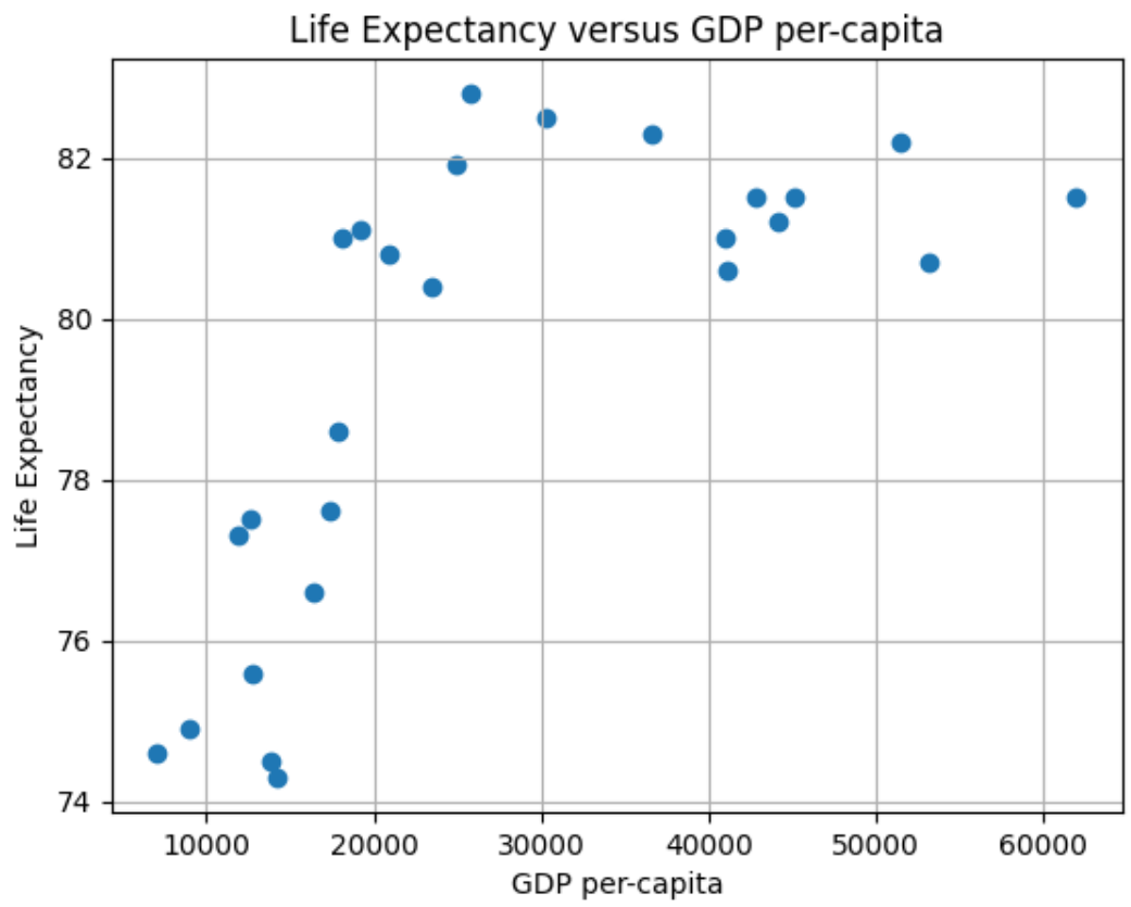
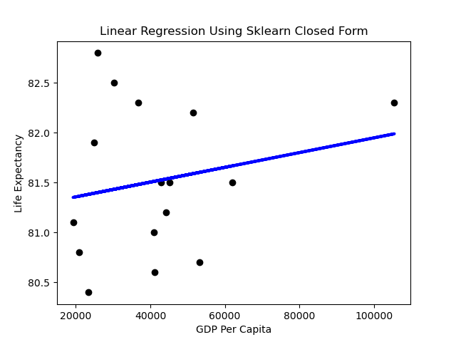
Now we have removed Luxembourg due to its very high per-capita GDP, and we are still left with a graph that appears to not be linear. Was this the right thing to do? Luxembourg’s high per-capita GDP is not noise, nor an erroneous measure: it’s an accurate measure of a country in the EU. Moreover, it wasn’t an outlier in terms of life expectancy–it was very much aligned with Western Europe.
An interesting interpretation of the above might be that we should have let Luxembourg remain, and considered Eastern Europe as essentially a different distribution. Eastern Europe nations in the EU are prone to certain habits (e.g. smoking) that align them together and result in a lower life-expectancy versus the rest of the EU. The interested reader can study the issues in more detail if desired by starting with the Sep 24th 2018 edition of the Economist.
This is one of those messy nuances of data cleaning and feature engineering that Data Scientists spend much of their time delving into to arrive at viable results. Another approach with the Luxembourg issue would be to weigh datapoints–an example would be to use the population size of the country to associate a relative weight.
Another question is: is there a better approach to visualization than a matplotlib scatter diagram that allows for quick analysis of details? For that we introduce the use of the Plotly library and also Chart Studio for easily hosting interactive Plotly graphs. With this it becomes easy to pick out the problem with Eastern Europe.
What happens to the shape of the scatter plot if we take Eastern Europe out and leave Luxembourg in? The resulting graph is below.
The First Prediction
We can generate a simple prediction line using the Sklearn library as below. The code to produce this is:
from sklearn.linear_model import LinearRegression
regr = LinearRegression()
regr = LinearRegression().fit(X.reshape(-1,1),y)
y_pred = regr.predict(X.reshape(-1,1))
# Plot outputs
plt.scatter(X, y, color="black")
plt.plot(X, y_pred, color="blue", linewidth=3)
plt.title("Linear Regression Using Sklearn Closed Form")
plt.ylabel("Life Expectancy")
plt.xlabel("GDP Per Capit
Performance
A first impression might be that the slope of the line is rather flat. What does it mean when the dependent variable doesn’t change much as the independent variable varies? Horizontal lines mean the independent variable is not all that predictive.
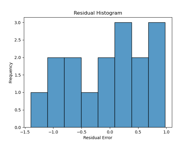
Linear Regression assumes normality of the error term. One way to test that the assumptions of Linear Regression are met is to subject the results to series of statistical tests and graphs. One of these is the graph of residuals–residuals are the errors between the predicted values and real values. Such a graph should show no discernable pattern and should center around zero. We see below that this is the case.
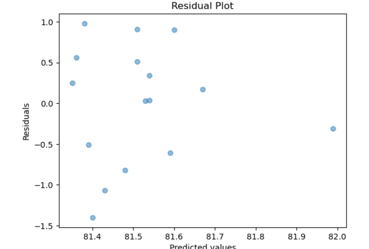
Next we plot a simple histogram of the residuals and check its shape against a normal bell curve.
hist_plot = sns.histplot(y_pred-y,bins=8)
plt.title("Residual Histogram")
plt.ylabel("Frequency")
plt.xlabel("Residual Error")
This is a fairly limited set of points, but the plot doesn’t depict a normal curve shape as closely as would be hoped if we wanted to have confidence in the predictive value of GDP. On the other hand, there are very few datapoints in this example–exchanging two datapoints can make it look more Gaussian.
Scaling
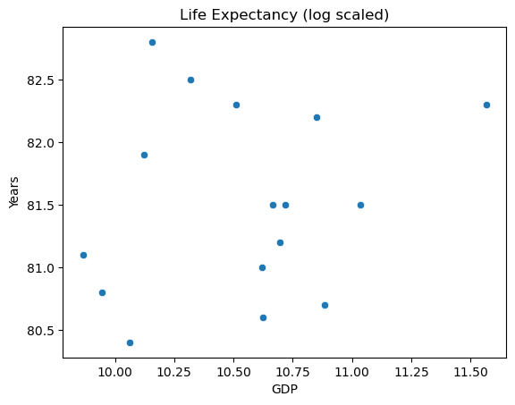
Returning to the issue of feature engineering: a common approach to improve the look of the feature scatter plot is transformation. Applying a log transformation to X results in a more promising visualization:
sns.scatterplot(x=np.log(X), y=y)
plt.title("Life Expectancy (log scaled)")
plt.ylabel("Years")
plt.xlabel("GDP")
The transformed inputs make for a better looking spread. It might be tempting to scale the response variable as well, but this makes for tricky interpretation.
Multiple Linear Regression
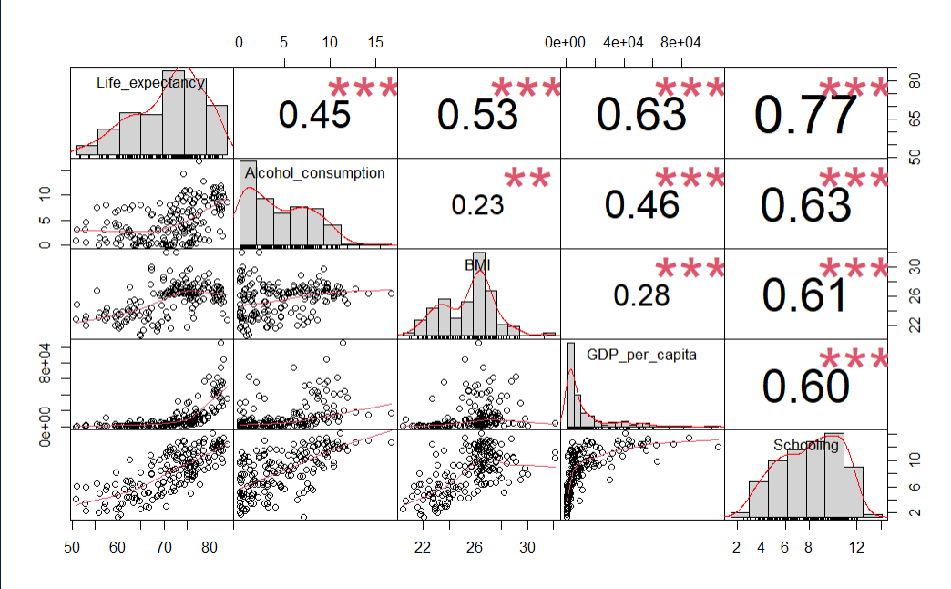
Using more than one variable would be a natural choice for our dataset. Settling on the year 2015, and choosing the most intuitive explanatory features results provides a starting point. Analyzing correlations amongst these variables with the Performance Analytics library in R results in the below chart.
le_df <- le_df[le_df$Year == 2015,]
le_df <- le_df[-c(le_df$Year)]

# Choose some intuitive predictors
predictors <- c("Alcohol_consumption", "BMI", "GDP_per_capita", "Schooling")
data_sub <- subset(le_df,  select=c("Life_expectancy",predictors))

# Reset index
row.names(data_sub) <- NULL

# Correlation
cor(data_sub$Life_expectancy, data_sub), check_names = False)
chart.Correlation(data_sub, histogram=TRUE, pch=19)
Using R and rstan_glm
If there is a needto shift paradigms from Maximum Likelihood to Bayesian and fit using Monte Carlo simulations versus the closed form, then a shift to Stan might be warranted. The reason for shifting to R is, in addition to just demonstrating some R Visualizations, that most people I see using Stan implementation seem to use rstan more than pystan (an anecdotal conclusion to be sure).
Initial Fit with unscaled data
fit0 <- stan_glm(Life_expectancy ~ ., data=data_sub, refresh=0)
print(fit0)
This is rstantools version 2.3.1.1
This is bayesplot version 1.10.0
- Online documentation and vignettes at mc-stan.org/bayesplot
- bayesplot theme set to bayesplot::theme_default()
   * Does _not_ affect other ggplot2 plots
   * See ?bayesplot_theme_set for details on theme setting

stan_glm
 family:       gaussian [identity]
 formula:      Life_expectancy ~ .
 observations: 179
 predictors:   5
------
                    Median MAD_SD
(Intercept)         47.7    4.8
Alcohol_consumption -0.1    0.1
BMI                  0.4    0.2
GDP_per_capita       0.0    0.0
Schooling            1.4    0.2

Auxiliary parameter(s):
      Median MAD_SD
sigma 4.7    0.3
Unscaled Density Graph
Density plots allow for looking at the distribution of the variables and show how they relate along with their relative normality. This can be a good tool for establishing the need and/or effect of scaling.
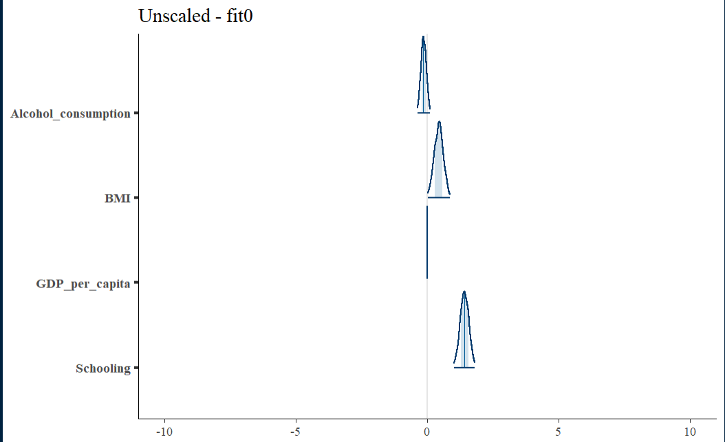
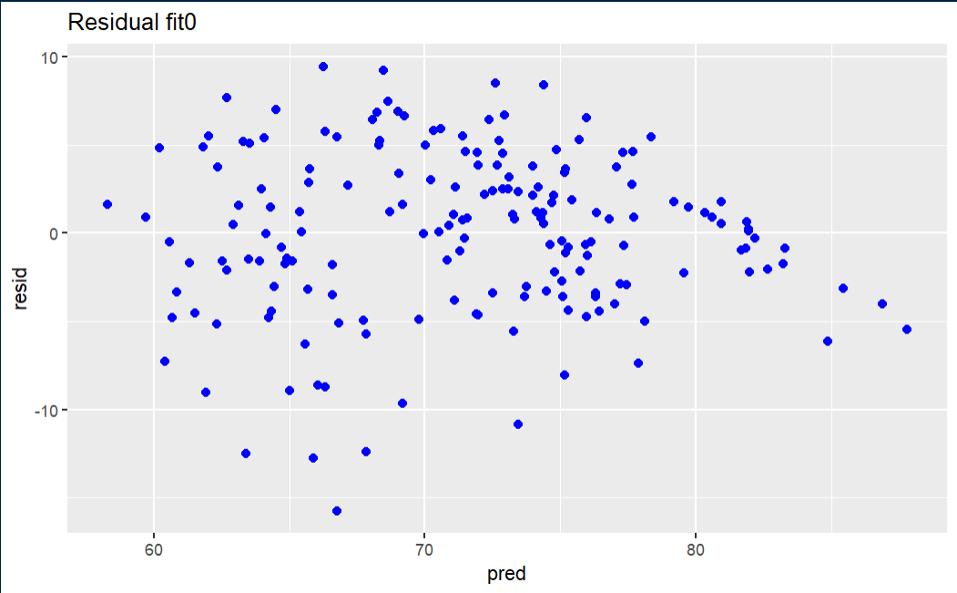
Initial fit residual
The fit0 residual graph is not terrible, but it has a hint of triangularity.
