Most people interested in Security Informatics will have come across Bayesian analysis or Base Rate Fallacy analysis of log intrusion data. The seminal work is the paper by Stefan Axelsson; his published work is available here. Here is a very brief recap example-the actual values are not that critical as we want mainly to introduce and highlight certain concepts that may not be clear from examples around the web.
Assume
A = an intrusion
B = an intrusion alert (e.g. an alert from your IPS)
Bayes’ theorem tells us:
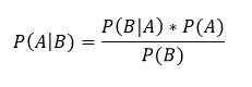
Translated to English, this means that the probability of an intrusion given an alert, P(A|B), is equal to the prior established probability of the incidence of intrusions as a factor of the accuracy levels of the detection tool. The accuracy levels or the tools are established by you or the vendor empirically: they relate to how often it flags true positives (i.e. its ability to flag an intrusion record as such) and how often it flags a non-intrusion record as an intrusion record (the false positive rate).
Examples of this calculation relating to disease detection are ubiquitous on the web. Usually there is some rare disease under consideration, and the clinical test is 99% accurate at finding the disease when it’s actually present (true positive rate) and an expression of the instances it finds the disease even when it’s not present, say .5% (the false positive rate).
Put simply, if we believe we know the background incidence of intrusion P(A)–maybe by experimentation or previous experience-we can calculate the expectation of an intrusion given an alert. We must also know the accuracy rate of the detector, i.e. the true positive rate and the false positive rate. We probably have reason to believe that the device accuracy is good: that rates are somewhere around 99% true positives and 1% false (otherwise how do you explain to Mgmt why you bought and use it).
A point worth keeping in mind: in P(A|B), ‘A’ is the hypothesis and ‘B’ is the fact at hand–we know we have an alert, but is it an intrusion? P(A|B) is the probability that it is. The Bayesian approach is to leverage what you know to analyze something you don’t know.
A concrete example, if we log 10,000,000 records a day, and each record is examined by an intrusion detector, what can we project about how the rate of false positives impacts our intrusion hunting? We need the three items discussed: the rate of actual intrusion and the two facets of device accuracy. Now, accurately setting the incidence of intrusion for all contexts is likely far more problematic that most articles on this subject maintain–let’s come back to that later. For now, let’s say we know:
- background incidence of intrusion is .005% of discrete logged records (roughly a few intrusions per day)
- detector accuracy of true positives is 99%
- detector rate of false positives is .01 – that is 1% of the time an alert will be a false positive
This gives us an incidence rate per record of
![]()
Switching to an alternative but equivalent form of Bayes’ theorem convenient for calculation:
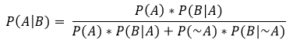
Filling in the values from what we know:
- P(A) = .00005
- P(B|A) = .99 (99% of the time if there is a true intrusion record, it will be flagged)
- P(B|~A) = .01 (the established rate of detector false positives-note this rate is independent of the 99% rate of true positives–they don’t need to add to 100%)
- P(~A) = 1 – P(A) = .99995 (by definition )
This gives us:
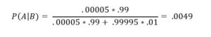
Base Rate Fallacy
This means that 9951 times out of 10,000, the alert you track will be a false positive. The revelation of Bayes is that you would have not have guessed this looking at the various accuracy assumptions we made. If a system is 99% accurate at detecting intrusions, we might have guessed that almost all of the alerts were going to be intrusions. This misplaced intuition is what is termed the Base Rate Fallacy. Here is an eye-opening example on Wikipedia based in terms of breathalyzers and drunk driving.
Why does this phenomenon occur? This occurs in cases where an incidence is rare enough that almost any non-zero rate of false positive measurement overwhelms the true positives. Think of it this way: what if there was a single person in the entire world that had condition X. Suppose you have a test for condition X, and you tested everyone in the entire world. Suppose further that your test was absolutely guaranteed to turn up positive if someone had condition X (100% true positive rate-no missed positives). Now, what if your test had a .0001% false positive rate. That would be one incredibly accurate test! However, the results would be that 7,000 people tested positive for condition X, and only 1 person actually had it. Hence, the results are overwhelmed by false positives.
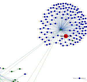
Now, back to IT: was this a useful exercise with respect to how we actually log , correlate, alert and analyze logs? Not all logs are equal: some logs come from DMZ systems where there might be a very high incidence of attacks. Other logs may come from our web servers and merely relate who is visiting what links. If you leave a switch in the DMZ open to SSH, you are likely to log hundreds of brute force password attempts against it–this is not likely to be lost in a sea of false positives and it’s not in a context where a .0005 incidence of intrusion rate per record holds true. It’s probably not a needle in a haystack: there is likely some visual or tabular summary of events designed to make such an alert standout.
Possible takeaways include:
- Reinforce that reducing false positives to near zero is critical in environments where the incidence of actual intrusion is very low and quantity of records astronomically high.
- Not all logs are equal – weighting can be critical
- Maybe it’s not even possible to reduce false positives in some environments down to an alert-actionable status. Such instances require more anecdotal methods and creative visualizations to aid hunting teams
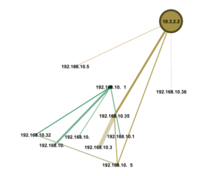
Event Grouping
Raw alerts may not be that fruitful for sifting through without a winnowing strategy, but what if one can arrange alerts in the context of other interesting log events? Hundreds of login attempts from a source IP might be interesting: should the system have a countermeasure against rapid brute-force attacks. However, what would be even more interesting is if a login attempt from that IP ever ended up working. Teaching a system to bubble up events as patterns of attack emerge is the real answer to the Base Rate Fallacy and alert fatigue.