Data Visualization Using MatPlotLib Animation (1st of a Series)

There are a multitude of articles and examples out there demonstrating how to create animations using matplotlib’s FuncAnimation library. That said, they tend to be both challenging to follow and more oriented towards plotting lines than tabular data. This series of articles will delve into the details of animating tabular data plots: the plan here is start at the very beginning and explain the process in detailed steps.

The examples here will be built with a Jupyter Notebook from Anaconda 3.7.4. Data Notebooks built on Jupyter are great for documenting data explorations including sharing plotting and animation visualizations.

As a preliminary, you will need matplotlib, numpy pandas and a video writer–the writer I used is ffmpeg and I installed this via the Anaconda shell using:

conda install -c conda-forge ffmpeg

Also, the version of matplotlib used here is 3.1.2. Below is the line of code to assist in checking this on your system.

print(plt.__version__)

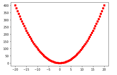
The first challenge of understanding the use of matplotlib is comprehending why some examples use pyplot and other axes (usually denoted as ax) objects. Suppose the aim is to draw a parabola. The first approach can be done with a few simple lines of code:

import numpy as np
import matplotlib.pyplot as plt
%matplotlib inline
#create the function: f(x) = y**2
x = np.arange(-20., 20.1, 0.5)
#draw the figure MATLAB-style with red squares
p = plt.plot(x, x**2, 'rs')
plt.xlabel("X")
plt.ylabel("Y")
plt.title("Example 1")
plt.show()
Parabola in red squares using pyplot

I think of such examples as being in the older MATLAB-style of procedural plotting. MATLAB was the inspiration for the original creator of the matplotlib library and is programmatically similar to the above code’s use of a single function to carry out all plotting tasks. In terms of implementation, this style hides the OO details. However, under the hood, the procedural style implicitly references objects and methods

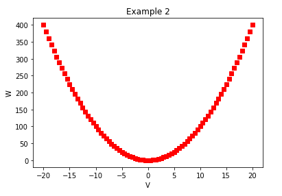
The Object-Oriented approach features direct calls to the methods of the underlying objects. The underlying objects being the Figure and the Axes. Roughly, an axes object refers to the the x-axis and y-axis, but also includes the other components of the graph. Thus, axes does not strictly-speaking refer to the plural of axis in this context. Drawing the same parabola with the OO code is demonstrated below.

v = np.arange(-20., 20.1, 0.5)
fig, ax = plt.subplots()
ax.set_xlabel('V')
ax.set_ylabel('W')
ax.set_title('Example 2')
ax.plot(v,v**2,'rs')
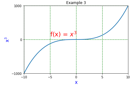
Parabola example from OO methods

Adding Complexity

An advantage of using OO method calls is the plethora of nicely-organized customizations one can make to a graph. If a laundry-list of requirements has to be implemented:

  • custom ticks
  • colored grid
  • text or annotations
  • customized axis label with non-default font

The implementation is a simple matter of looking up the methods in the axes documentation. Below is an implementation.

x = np.arange(-20., 20.1, 0.5)
fig, ax = plt.subplots()
ax.set_xlabel('$\mathregular{x}$', fontsize=15, color='b')
ax.set_ylabel('$\mathregular{x^3}$',fontsize=15, color='b')
ax.set_title('Example 3')
#add a grid pattern
ax.grid(color='green', linestyle='--', linewidth=1)
#set the axis limits
ax.set_xlim([-10, 10])
ax.set_ylim([-1000, 1000])
#customize the x-ticks
ax.set_xticks([-10,-5, 0,5, 10])
#customize the y-ticks
ax.set_yticks([-1000,0,1000])
#add some text
ax.text(-5, 100, r"f(x) = $x^3$", color="r", fontsize=20)
ax.plot(x,x**3, lw=2)
Hyperbola example

Animating

When a static plot is not enough, Matplotlib provides simple animation tools via the animation module. In the code example below the FuncAnimation class is added to the previous hyperbola-generating code. There are some changes to the flow that are needed to implement the animation–these will be described in detail later. For now, it’s enough to appreciate the relative ease with which the examples above can be animated.

import numpy as np
import matplotlib.pyplot as plt
from matplotlib import animation 
%matplotlib inline

#create a figure and axes
#fig = plt.figure(1,1)
#ax = plt.axes(xlim=(-10, 10), ylim=(-1000, 1000))
fig,ax = plt.subplots(1,1)
plt.close() #avoid a ghost plot
line, = ax.plot([], [], lw=3) #this returns a tuple

ax.set_xlabel('$\mathregular{x}$', fontsize=15, color='b')
ax.set_ylabel('$\mathregular{x^3}$',fontsize=15, color='b', labelpad=-10)
ax.set_title('Example 4')
#add a grid pattern
ax.grid(color='green', linestyle='--', linewidth=1)

#customize the x-ticks
ax.set_xticks([-10,-5, 0,5, 10])
#customize the y-ticks
ax.set_yticks([-1000,0,1000])
#add some text
ax.text(-5, 100, r"f(x) = $x^3$", color="r", fontsize=20)

#create the data - initially empty
xdata_l = []
ydata_l = []

def animate(n):
    '''
    produces a sequence of values when called sequentially
    '''
    xdata_l.append(n)
    ydata_l.append(n**3)
    line.set_xdata(xdata_l)
    line.set_ydata(ydata_l)
    return line,

def init():
    line.set_data([], [])
    return line,

#generator
def gen_function():
    '''
    Generate the values used for frame number
    '''
    for i in np.arange(-20,20.1,.5):
        yield i


#animate
anim = animation.FuncAnimation(fig, animate, init_func=init, frames=gen_function, interval=50)

#play this animation on Jupyterlab
from IPython.display import HTML
HTML(anim.to_html5_video())

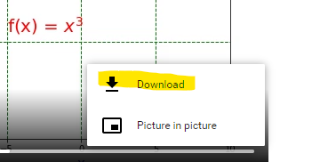
This produces the following video:

Animation of the hyperbola

The resulting animation, in video form, can be downloaded from Jupyterlab simply by clicking on the three dots and choosing download.

Saving the video

Binning with Pandas

This article will review two powerful and timesaving methods available from Pandas and Numpy that can be applied to problems that frequently arise in Data Analysis. These techniques are especially applicable to what is sometimes called ‘binning’ -transforming continuous variables into categorical variables.

The two methods are np.select() and pd.cut(). I call these Pandas tricks, but some of the actual implementation is taken from Numpy and applied to a Pandas container.

np.select()

Most Pandas programmers know that leveraging C-based Numpy vectorizations is typically faster than looping through containers. A vectorized approach is usually simpler and more elegant as well–though it may take some effort to not think in terms of loops. Let’s take an example of assigning qualitative severity to a list of numerical vulnerability scores using the First.org CVSS v3 mapping:

RatingCVSSv3 Score
None0.0
Low0.1 – 3.9
Medium4.0 – 6.9
High7.0 – 8.9
Critical9.0 – 10.0
First.org qualitative CVE Severity Table

Suppose you have a large DataFrame of scores and want to quickly add a qualitative severity column. the np.select() method is a fast and flexible approach for handling this transformation in a vectorized manner. We can begin by making up some fictional CVEs as our starting dataset

import numpy as np
import pandas as pd
df = pd.DataFrame({"CVE":["CVE-2030-"+ str(x) for x  in range(1,101)],"CVSSv3":(np.random.rand(100)*10).round(2)})

The above is a quick way to build a random DataFrame of made-up CVEs and scores for demonstration purposes. Using np.select() presents a slick vectorized approach to assign them the First.org qualitative label.

Begin by assembling a Python list of conditions based on the First.org labels, and place outcomes in separate Python list.

conditionals = [
    df.CVSSv3 == 0,
    (df.CVSSv3 >0) & (df.CVSSv3 <=3.95),
    (df.CVSSv3 >3.95) & (df.CVSSv3 <=6.95),
    (df.CVSSv3 >= 6.95) & (df.CVSSv3 <=8.95),
    (df.CVSSv3 >= 8.95) & (df.CVSSv3 <= 10)
]

outcomes = ["None","Low","Medium","High","Critical"]

Using the Conditionals

At this point a new qualitative label can be applied to the dataset with one vectorized line of code that invokes the conditionals and labels created above:

df["Severity"] = np.select(conditionals,outcomes)

pd.cut()

An alternative approach, one that is arguably programmatically cleaner but perhaps less flexible, is the Pandas cut() method. There are lot of options for using pd.cut(), so make sure to take some time to review the official documentation to understand the available arguments.

One option is to set up a series of intervals using a Python list. It is important to remember that the intervals will, by default, be closed to the right and open to the left. Below is an initial attempt to pattern intervals after the First.org boundaries

bins = [0,0.01,3.95, 6.95, 8.95, 10]

Now that the boundaries are established, simply add them as arguments in a call to pd.cut()

df["Severity2"] = pd.cut(df.CVSSv3,bins, labels=["None","Low","Medium","High","Critical" ], retbins=False)

This results in the following

As always, it is prudent to do some testing: especially to test the boundary conditions. We can redo the array-building exercise while appending a few custom rows at the end using the following code:

np.random.seed(100)
df = pd.DataFrame({"CVE":["CVE-2030-"+ str(x) for x  in range(1,101)],"CVSSv3":(np.random.rand(100)*10).round(2)})
df.loc[len(df.index)] = ['CVE-2030-101', 0] 
df.loc[len(df.index)] = ['CVE-2030-102', 10] 
df.loc[len(df.index)] = ['CVE-2030-103', 0.1] 
df.loc[len(df.index)] = ['CVE-2030-104', 9.0] 
df.loc[len(df.index)] = ['CVE-2030-105', 4.0]
df.loc[len(df.index)] = ['CVE-2030-106', 3.96]
df.tail(10)

The df.loc[len(df.index)] simply locates the index value needed to add an additional row. Setting a random seed in line 1 above makes the DataFrame reproducible despite the values being randomly generated.

Now, if this were a unit test, then we would assert that CVE-2030-101 would have qualitative value ‘None’ and CVE-2030-106 would have qualitative value ‘Medium’. Note that for readability we can also improve the way we label the columns of the DataFrame to more readily identify the type of binner employed. Running the binner routines results in:

np.random.seed(100)
df = pd.DataFrame({"CVE":["CVE-2030-"+ str(x) for x  in range(1,101)],"CVSSv3":(np.random.rand(100)*10).round(2)})
df.loc[len(df.index)] = ['CVE-2030-101', 0] 
df.loc[len(df.index)] = ['CVE-2030-102', 10] 
df.loc[len(df.index)] = ['CVE-2030-103', 0.1] 
df.loc[len(df.index)] = ['CVE-2030-104', 9.0] 
df.loc[len(df.index)] = ['CVE-2030-105', 4.0]
df.loc[len(df.index)] = ['CVE-2030-106', 3.96]
df["Severity pd.cut()"] = pd.cut(df.CVSSv3,bins, labels=["None","Low","Medium","High","Critical" ])
bins = [0,0.01,3.95, 6.95, 8.95, 10]
df["Severity np.select()"] = np.select(conditionals,outcomes)
df.tail(10)

The boundary testing has turned up a problem: the pd.cut() doesn’t handle the value zero because the first interval – 0, 0.1 is open on the left. Such an interval is designated by math types as (0, 0.1], with the parenthesis indicating that zero is not contained in the interval. This bug is easily addressed–the interval can be started at -.99 rather than zero. Alternatively, one could use the method’s arguments to adjust the open-on-left, closed-on-right default behavior.

The pd.cut() bin intervals are adjusted as:

bins = [-.99,0.01,3.95, 6.95, 8.95, 10]

Running the entire code again looks like this:

np.random.seed(100)
df = pd.DataFrame({"CVE":["CVE-2030-"+ str(x) for x  in range(1,101)],"CVSSv3":(np.random.rand(100)*10).round(2)})
df.loc[len(df.index)] = ['CVE-2030-101', 0] 
df.loc[len(df.index)] = ['CVE-2030-102', 10] 
df.loc[len(df.index)] = ['CVE-2030-103', 0.1] 
df.loc[len(df.index)] = ['CVE-2030-104', 9.0] 
df.loc[len(df.index)] = ['CVE-2030-105', 4.0]
df.loc[len(df.index)] = ['CVE-2030-106', 3.96]
bins = [-.99,0.01,3.95, 6.95, 8.95, 10]
df["Severity pd.cut()"] = pd.cut(df.CVSSv3,bins, labels=["None","Low","Medium","High","Critical" ])
df["Severity np.select()"] = np.select(conditionals,outcomes)
df.tail(10)

This is the result we were expecting.

Note one other interesting implementation detail; the CVSSv3 mapping from First.org uses precision = 1 and the code and data generation used here was done with precision = 2. That is a detail that may well have led to unexpected results. We could have adjusted the random generator to round to a single digit after the decimal, or simply reset the DataFrame using the round function:

df = df.round(1)