Category Archives: Network Science

Persisting Network Graphs with ArangoDB

ArangoDB is a notable NoSQL database system that may be of interest to security and other informatics specialists that need to scale document collections (JSON), graphs, or name/value pairs–any or all in one implementation. The commercial entity behind Enterprise ArangoDB support is a German company out of Cologne that is currently looking to re-locate it’s HQ in the US.

ArangoDB is parallizable via sharding much in the model of Mongo; however an interesting feature is the ability to base shards on communities in the case of graphs–hence minimizing network overhead when following paths, looking for neighbors, etc. To my knowledge one has to actually come up with the community scheme and then re-arrange the shards accordingly–it is not dynamic.

Given the past discussion of graphing with networkx, I thought it may be interesting to think about how to persist data out-of-memory with a graphing database such as ArangoDB.  I attended a presentation on ArangoDB at some point and went on to dabble with an ArangoDB instance to learn how to load graph data formatted in the Graph Modeling Language (GML).

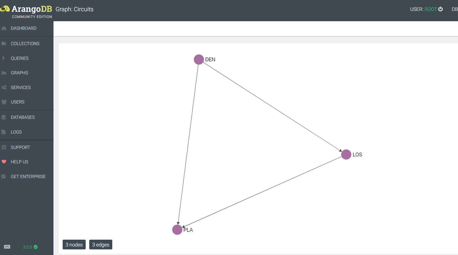
Arangodb has some nice sample data and tutorials to get users started setting up collections and querying with their custom SQL-like query language called AQL.  For a quick initial demo I created a very simple collection of datacenters and circuits:

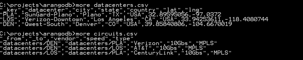
This allows for the import of the circuits into an edge collection, and the datacenters into a vertex collection. At this point a graph can be created and queried along the edges. If we wanted to see which datacenters were available via private circuits and the associated shortest path, this would be doable within this scheme much more efficiently versus a traditional RDBMS. Next I could put detailed circuit information and contacts into an associated JSON document and be able to pull up information along the way–e.g. I could query the path router by router. ArangoDB implements edges and vertices as JSON documents, with a from and to relationship in the case of edges.

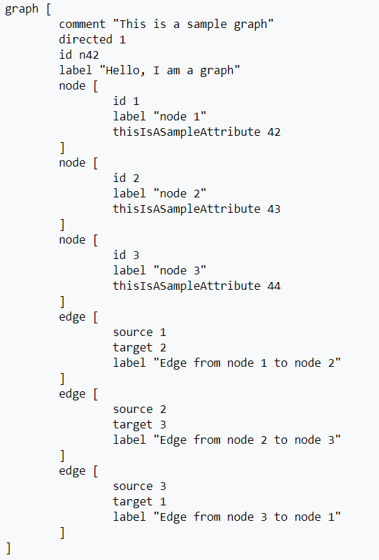
Referring back to the Autonomous Systems routing organization data that was discussed in this blog recently, we see that this used a GML dataset and was loaded via Python networkx. What if we wanted to load the GML into ArangoDB? To my knowledge there is no native support for this: one has to break the dataset into nodes and edges and then import as collections. It’s fairly simple to condition a GML file for this-see the routines in cond_gml.py here. Looking at the Wikipedia example below it is easy to see that GML is straightforward to parse into CSV.

The repository contains routines to do this parsing for you: this simply consists of breaking it out into edges and nodes. Disclaimer: I need to verify and test with more GML dataset examples to validate that this works universally, but because the logic is trivial any user should be able to modify and tweak as needed.

In examining edges, given that there is this from, to structure to each edge in ArangoDB, it gets confusing as to whether every graph is explicitly directional. A graph can be queried using syntax that specifies Inbound, Outbound, or Any–thus the graphs can be interpreted and queried as undirected.

def edgeparser(ary):

    # create a source and target list, then push them into a result list of tuplets
    result,source,target = [],[],[]
    for item in ary:
        if 'source' in item:
            num = re.findall('\d+',item)
            # use join and int to get rid of brackets and quotes
            source.append(int(''.join(num)))
        if 'target' in item:
            num = re.findall('\d+',item)
            target.append(int(''.join(num)))
    for i in range(len(source)):
        result.append((source[i],target[i]))
    return result

##############################################################
# name: nodeparser.py
# purpose: utility routine to harvest nodes from GML
# input: list ary  # ary contains the raw data
# output: results # list of tuplets is a list of tuplets # (<node id>, <node label>
##############################################################
def nodeparser(ary):

    # create a source and target list, then push them into a result list of tuplets
    result,ident,label = [],[],[]
    for item in ary:
        if 'id' in item:
            num = re.findall('\d+',item)
            # use join and int to get rid of brackets and quotes
            ident.append(int(''.join(num)))
        if 'label' in item: # label is the actual node name
            num = re.findall('\d+',item)
            label.append(int(''.join(num)))
    for i in range(len(label)):
        result.append((ident[i],label[i]))
    return result

Once we have the nodes and the edges, we can input as CSV using the ArangoDB console GUI or the ArangoDBsh.exe command shell. However, it is a more useful exercise to learn how using Python. There are two popular Python drivers for ArangoDB–I chose to work with pyArango simply because the ArangoDB.com site uses that module in their tutorials and documentation (I believe the creator of pyArango was a contractor with ArangodB commercial). Feel free to switch if the other module turns out to be superior or simpler.

It’s not exactly simple to load graphs with the pyArango module. One needs to heed the example code and create some overhead classes.  I’m unaware of much in the way of documentation for this, but here is an example I coded of implementing a tuplet loader. GML datasets can be interpreted as a pair of files containing tuplets [node labels, node ids] , [edge from, edge to]. Again, all of the code is in the repository.

#######################################################
# name: gml_loader.py
# purpose: load graphs into arangodb based on conditioned files from a GML
# need an edges.txt and a nodes.txt file - see cond-gml.py for creating these
# input: strings username, password, database (default is _system)
#
# author: adapted from pyrango example by Ray Zupancic
#######################################################

import sys
import getopt
from pyArango.connection import *
from pyArango.graph import *
from pyArango.collection import *


class AS(object):
        class nodes(Collection) :
            _fields = {
                "name" : Field()
            }


        class paths(Edges) :
            _fields = {
                "number" : Field()
            }

        class as2006(Graph) :

            _edgeDefinitions = (EdgeDefinition ('paths',
                                                fromCollections = ["nodes"],
                                                toCollections = ["nodes"]),)
            _orphanedCollections = []


        def __init__(self,nodes_tup,edges_tup, user, pw, db = "_system"):

               self.nodes_tuples = nodes_tup
               self.edges_tuples = edges_tup
               self.conn = Connection(username=user, password=pw)
               ndict = {}

               self.db = self.conn[db]

               self.nodes   = self.db.createCollection(className = "nodes")

               self.paths = self.db.createCollection(className ="paths")

               g = self.db.createGraph(db)

               for item in self.nodes_tuples:
                   # uncomment if you want to watch the routine load
                   #print("id:", item[0]," label:", item[1])

                   n =  g.createVertex('nodes', {"name": item[1],  "_key": str(item[0])})
                   n.save()
                   ndict[item[0]] = n

               for item in self.edges_tuples:

                   print(item)
                   strval = str(item[0]) + "_" + str(item[1])
                   g.link('paths', ndict[item[0]],ndict[item[1]], {"type": 'number', "_key": strval})


#####################
# name: stub to run AS - Autonomous System Graphing Class
#####################
def main(argv):


    if len(sys.argv) <3:
        print('usage: gml_loader.py -d database -u <arangodb_username> -p <arangodb_password>')
        sys.exit()

    try:
        opts, args = getopt.getopt(argv,"hd:u:p:",["username=","password="])
    except getopt.GetoptError:
        print('gml_loader.py -d database -u <arangodb_username> -p <arangodb_password>')
        sys.exit(2)

    for opt, arg in opts:
        if opt == '-h':
            print('gml_loader.py -d database -u <arangodb_username> -p <arangodb_password>')
            sys.exit()
        elif opt in ("-u", "--username"):
            username = arg
        elif opt in ("-p", "--password"):
            password = arg
        elif opt in ("-d", "--database"):
             db= arg
    print( 'database: ', db)
    print( 'username: ', username)
    print( 'password: ', password[0:2] + '*****')

    # read in the paths and nodes as tuplets
    with open('edges.txt') as f:
        edges_col = []
        for line in f:
            #strip new-line, split into a tuple, and append as integer rather than string
            val1,val2 = line.rstrip('\n').split(',')
            edges_col.append((int(val1),int(val2)))

    with open('nodes.txt') as f:
        nodes_col = []
        for line in f:
            #strip new-line, split into a tuple, and append as integer rather than string
            val1,val2 = line.rstrip('\n').split(',')
            nodes_col.append((int(val1),int(val2)))

    AS(nodes_col, edges_col, username, password, db)


if __name__ == "__main__":
    main(sys.argv[1:])

Once you have the AS dataset loaded, you can run queries on it using AQL or embed AQL in pyArango. Here are some examples:

#######################################################
# name: get_shortest_path
# purpose: get shortest path between two nodes
# input: conn_object: db; strings: node1, node2
# ouput: path
#
#######################################################
def get_shortest_path(db, n1, n2):
    aql = "FOR e, v IN ANY SHORTEST_PATH 'nodes/{}' TO 'nodes/{}' GRAPH 'as2006' RETURN [e, v]".format(n1,n2)
    return db.AQLQuery(aql, rawResults=True, batchSize=100)

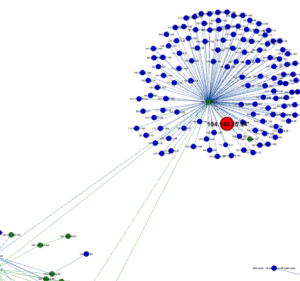
If we want to find the shortest path between Univ. of Colo Boulder and Indiana Univ. we just feed in their AS #’s.

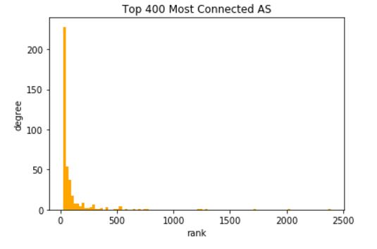
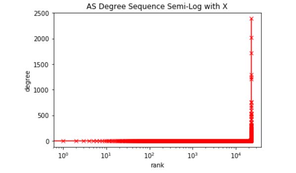
number of edges: 48436
number of nodes: 22963
key of node 400: 10836
Shortest path between IU and CU: 5

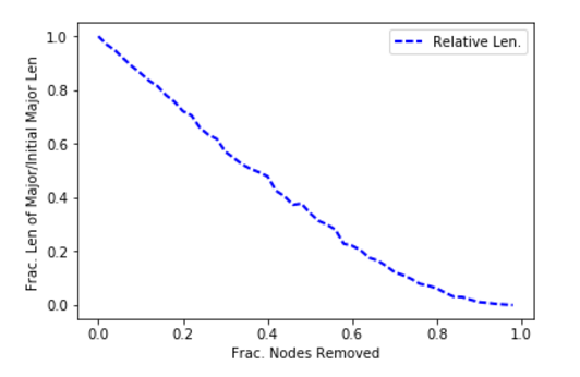
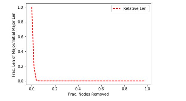
Note that I said shortest path in terms of AS hops and not necessarily the most optimal–this is simply a graph query demonstration, and, also, this is data from 2006 used to demonstrate graphing concepts. Because of the fact that the vertices are JSON docs and could hold meta-information about connectivity, it would possible to embed enough data to find optimal paths: e.g. break the  AS’s down into a circuit-by-circuit, router-by-router network as was being hinted at with the datacenter/circuit relationship introduced above.

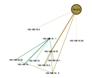
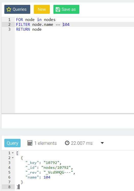
The ArangoDB console GUI tool is very nice for ad hoc queries as demonstrated below:

Summing up, this is very manageable and free software that can complement or even replace Mongo in some instances, and may prove invaluable to graph-oriented x-informatics projects.

Autonomous Systems: Studying Centrality and Failure Modes

Autonomous Systems (ASs) encapsulate an organization’s routing policies on the Internet. They make for interesting study as a candidate for  Network Science-style graphing. One reason an AS graph might be worth studying is as a case analysis demonstrating how to quantify failure and attack risk for a connected set of network devices . Many of the ideas can be extended to an interior routing topology within an organization. It is a bit of work to assemble the AS edges into a graph, but fortunately a few people have done this for us and put the results on the Internet. Unfortunately the latest complete version I found is a few years out of date, but the concepts remain the same.

There are plenty of pages dedicated to BGP hacks and security on the web. Check out this recent article on Network World, or this historical article from the Internet Protocol Journal if you want to learn more about securing BGP and the issues involved. The routing infrastructure of a Tier-1 backbone organization is not going to be brought down by a few router hardware failures, though cascading failure is always a concern (e.g. one failure overloads another router…). However, the outcome of a BGP hack is murkier.

Hardware failure is much more likely to bring down a smaller organization using BGP-I have worked at organizations over the years that had only one external facing router (albeit a fault-tolerant one with dual hardware). Likewise smaller shops are more prone to an attack being successful  as well–though they are less likely to be targeted.  Such a scenarios is not apt to affect other ASs: small organizations are not likely to be transit network that anyone else uses. If they are, they might not know it or want to be.

Finding a Dataset

An example AS dataset assembled into a GML graph is available from Mark Newman’s website. He has a good variety of datasets for study: in this case the data was collected from the Route Views project at the University of Oregon.

If you have trouble loading the graph, It may be necessary to edit out  gratuitous spaces in this GML. The following line  of networkx will work if you edit out white space (hint, use VIM or other UNIX tools to automate it as there are approx. 285k lines).

  • as_graph = nx.read_gml(‘as-22july06.gml’)

Looking at the dataset with networkx we see it has the following characteristics

  • Number of nodes: 22963
  • Number of edges: 48436
  • Average degree: 4.2186

 Let’s look at random fluctuations of the size of the major component as a result of taking out incremental slices of nodes (ASs). As you might expect with an Internet AS graph, the major component has the name number of nodes as the whole graph. We can define the increments as follows:

  • fractions = np.array(arange(0,1,.02))

This is simply 30 gradations of 0. , 0.02, 0.04, 0.06, 0.08, 0.1 , 0.12, 0.14, 0.16 , … 1.  We will degrade the AS nodes by this fraction per iteration and then re-calculate the size of the major component. Then we will graph the iterations and watch the breakdown in connectivity.


This is a very stable rate of degradation: this indicates the AS network is robust with respect to random failures. Now let’s take a look at what happens in a targeted attack: that is when an attacker chooses what to remove. In most cases a smart attacker will go after hubs, so we can simulate an attack by going after the nodes of highest degree. Using the same fractional increments, we get the follow result for the size of the major component.

This is a much less stable depiction of failure as nodes are removed. The problem is likely that the AS graph has so-called ‘super-hubs’ that control a lot of connectivity. This can be easily confirmed by looking at a degree distribution and looking at the top ten nodes. Below is the degree distribution. The second figure down is the entire degree distribution using a logarithmic scale.

It is easy to see that a few of the 22,000 nodes control a massive amount of connectivity, and the degree distribution is highly stratified into super-hubs. Working out the first few nodes we get the following (remember this is old data):

In Network Science there is a very interesting measure called Betweenness Centrality that alerts to the existence of nodes that do not necessarily have have high degree but are very central in terms of what they connect. On a network, this could be a case where a router with out many connections happens to be very central in connecting two regions. In the case of ASs it comes to mind that smaller degree NAPs (technically now called Internet Exchange Points) or the former Metropolitan Area Ethernets (e.g. MAE-West), or some similar structure might have low degree but high centrality.

For any medium size complex network (e.g. 10,000 to 100,000 nodes) this will be calculation best performed on an engineering workstation as it takes O(n*m) time where n is vertices and m is edges. For much larger networks one would want to consider approximation methods. Here are the results for ASs: 

This is interesting for its lack of results–no hidden connector of low degree was found in the top ten. This technique could be valuable for examining connecting devices in an Enterprise, however.

What then is the end result of trying to analyze old AS data? The various measures determined here: rate or random failure, rate of attack-based failure, centrality, and degree are quantifiers in a risk analysis. This removes the guesswork to some degree and informs risk teams of exactly what a device represents. You can Find the Jupyter Notebook code behind these explorations on github here.


Relationship Visualization

Network Science is, roughly speaking, the application of traditional Graph Theory to ‘real’ or empirical data versus mathematical abstractions. Modern Network Science courses, versus older Graph Theory courses, describe techniques for the analysis of large, complex ‘real world’ networks such as social networks. The topics tend to be mathematically challenging including community detection, centrality, Scale-Free modeling versus Random modeling and the associated probability distributions underlying the degree structure. In short, If you have a lot of interconnected data or logs, Network Science can likely help you organize and understand it.

Simple Visualization

For starters, complex network graphs often lend themselves to abstract relationship visualization of qualities not otherwise apparent. We can think of two categories of visualization: explicit attributes versus more subtle attributes inferred from algorithmic analysis such as community detection on what is perceived as a ‘lower‘ or secondary quality.  This second category could be based on machine learning, but no use in getting lost in marketing.

Most security professionals use explicit visualizations throughout the day, and likely would be lost without them–for example a chart of some event occurrence against time: if you use the Splunk timeline to pinpoint spikes in failed logins, you are using a data visualization to spot and explore potential attacks. Splunk is doing a large amount of work behind the scenes to present you with this, but it is still a simple representation against a time series, and it was always a relationship that  was readily apparent in conceptual terms–incredibly useful, but simply an implicit use of a standard deviation to note trends.

Another example is the ubiquitous use of Geo-IP data. Many organizations like to display the appearance and disappearance of connections in geographic terms: this makes for a nice world map at the SOC. Everyone can collectively gasp in the unlikely event that North Korea pops up. The reality is that the North Korean hackers are likely off hijacking satellite internet connections to launch their attacks as a source IP of Pyongyang is not all that discreet. Hence, discovering more subtle correlations may be warranted.

The deviation in this case consists of visualizing IP traffic from  ‘suspicious’ sources not normally seen. This geographic profiling is a valid tool in a threat hunter’s arsenal. The more interesting question, though: what more subtle qualities can we layer below the surface of that geographic profiling lead to glean more useful results-are there ways we could associate this with  a satellite-service IP or a pattern that leads us to look at other related domain registrations and cross-reference against our traffic? If we find some type of association, can we find even more subtle attributes in a like community: for example, is there a pattern or idiosyncrasy  of domain registration/registrars that an algorithm could uncover through community detection (use of free registrars, pattern in name of registration, contact details, time, etc)?

This is a potentially rich area of research. Going forward it will be interesting to study schemes for enriching data (e.g. essentially tying graph nodes and edges to JSON documents with meta-information). For now, just a simple demonstration of Threat Intelligence to graphing will be the exercise.

Threat Intelligence can lead to  more useful Simple  Visualizations

One way to glean useful insights involves  comparing traffic and connections logs with malware feeds, new domain lists, or other lists sites of low reputation. The results can be processed as a text list to review, but a graph depicting where an internal ‘victim’ address has touched along with internal connections to the victim is more interesting and potentially more helpful to a hunting team. The novel aspect of a graph visualization is the potential to view paths in detail.

A starter kit for reputation-based path visualizations might include:

  1. a threats or malware feed
  2. a connections log
  3. Python code parsing the above and saving results to a Networkx module graph
  4. Gephi for visualization

Suppose we have a threats feed with malware addresses (for simplicity lets use IPs), and a simple log of connections: the threats feed can be a list of IPs and the connections log a sequence of [Sender-IP, S-port, Receiver-IP, R-port, Transport, Protocol] objects. The objective  is to leverage simple visualizations to gauge exposure–a very simple example of visualizing a compromised internal address 10.3.2.2 is shown below.

en

We start by developing some code using the Python Networkx module to evaluate traffic logs and threat feeds and come up with intersections. Connections with bad actors get colored ‘red’. Conversations with outside hosts in general might be ‘blue’, and internal hosts might be ‘green’.

##################################################
# name: color_threats(g, u_lst, t_lst, e_lst)
# desc: add a color attribute to designate threat nodes
# input: nx.Graph g, list lst , list lst
# output: na
# notes: unique list, threats list and external IPs list
# are used to color
connected nodes
##################################################
def color_threats(g, u_lst , t_lst, e_lst):
    # e_lst is the list of external IPs
    # if an address is external, color it blue
    ext = re.compile(r’^192.168.*|^10.’)
        for j in e_lst:
            if not ext.match(j):
                g.node[j][‘viz’] = {‘color’: {‘r’: 0, ‘g’: 0, ‘b’: 255, ‘a’: 0}}
            else:
                g.node[j][‘viz’] = {‘color’: {‘r’: 34, ‘g’: 139, ‘b’: 34, ‘a’: 0}}

    # color the malware nodes
    risk_nodes = list(set(u_lst).intersection(t_lst))
        for i in risk_nodes:
            g.node[i][‘viz’] = {‘color’: {‘r’: 255, ‘g’: 0, ‘b’: 0, ‘a’: 0}}

The whole program is available on GitHub here. Below is a depiction of a malware connection on a busy network. Depending on how you lay them out, the visualizations can be large, hence this is an excerpt.

Layout on the fly (in one step) remains an interesting issue as Python code and Gephi visualizer are not entirely integrated.  A finished code base would ideally provide daily automated visualizations that one could click into to bring up details such as protocols, data volume, etc.

Looking to Network Science

Simple graph visualizations might end up being very useful in some contexts in place of trying to understand many lines of summarized logging. However, the strength of Network Science lies in attempting to use algorithmic analysis of very large data sets to bring to light things not quickly apparent. A typical large complex network simply looks like a blob when brought up graphically. Injecting algorithmic  interpretations of centrality and community detection based on attribute information embedded in the edges and nodes can lead to visualizations that provide breakthrough insights.